Curio: Movies By Color
 Monday, September 8, 2014 at 5:00PM
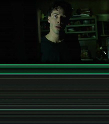
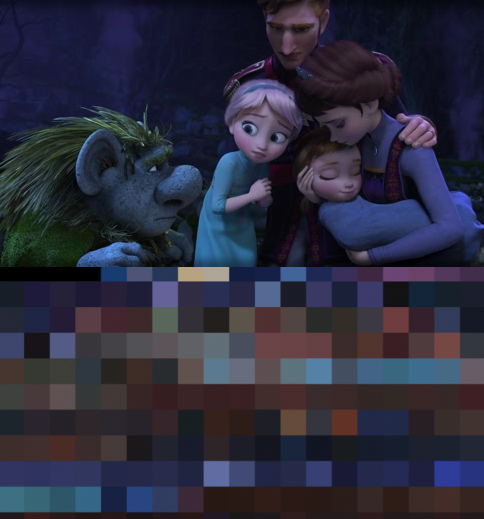
 Alexa here with your weekly fix of film art. I've always thought color impacts the mood of a film greatly: the pops of red in Pulp Fiction, the moody blue noir of Blade Runner, the dominant earth tones in The Big Lebowski. Along these lines, there has been a mini-trend lately of designers abstracting films according to their color palettes. My favorite is by designer Charlie Clark. Clark's project, titled "The Colors of Motion," takes the average hue from each frame of a film and then presents the frames together as horizontal stripes or square tiles. Distilled down to their palettes, The Matrix becomes a sea of green and black, and Frozen becomes a patchwork of dark blues and browns.


Clark's website, a wonderful time waster, allows you to navigate each film's colors in a number of ways, and compare the color to each frame. He is taking requests for films to color-code next, and he is selling prints too.
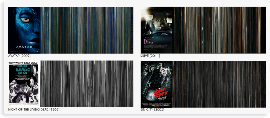
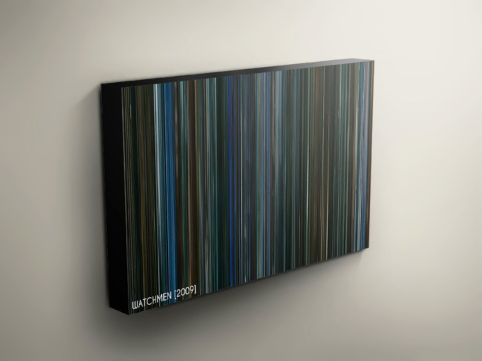
Another similar project that was recently the subject of a Kickstarter campaign is "Movie DNA," by Rob Hansen and Garrick Dartnell. This one captures every frame of a movie and squeezes it horizontally, stacking them to create an abstraction of vertical lines.

They have completed many more films than Clark; clicking through their gallery can be a fun game of "guess the film's dominant colors." They sell art prints and canvas prints through their website too.

 Colorology,
  Curio,
  Frozen,
  The Matrix


Reader Comments (1)
A huge round of applause, keep it up.