The Furniture: 25 Years Trapped in Castle Dracula
 Monday, November 13, 2017 at 11:37AM
 "The Furniture," by Daniel Walber, is our weekly series on Production Design. You can click on the images to see them in magnified detail.
 Bram Stoker’s Dracula turns 25 years old today. It is, appropriately, not dead. Not that a film can die, exactly, but this one has held onto its toothy vigor with particular success. Even the ridiculous way Keanu pronounces “Bewdapest” still charms. Eiko Ishioka’s Oscar-winning costumes seem simultaneously ancient and way ahead of their time. The same goes for the Oscar-winning makeup, which transforms Gary Oldman across centuries with bewildering commitment. The visual effects, which went unnominated, remain thrilling, a dizzying phantasmagoria of cinematic shadow-puppetry.
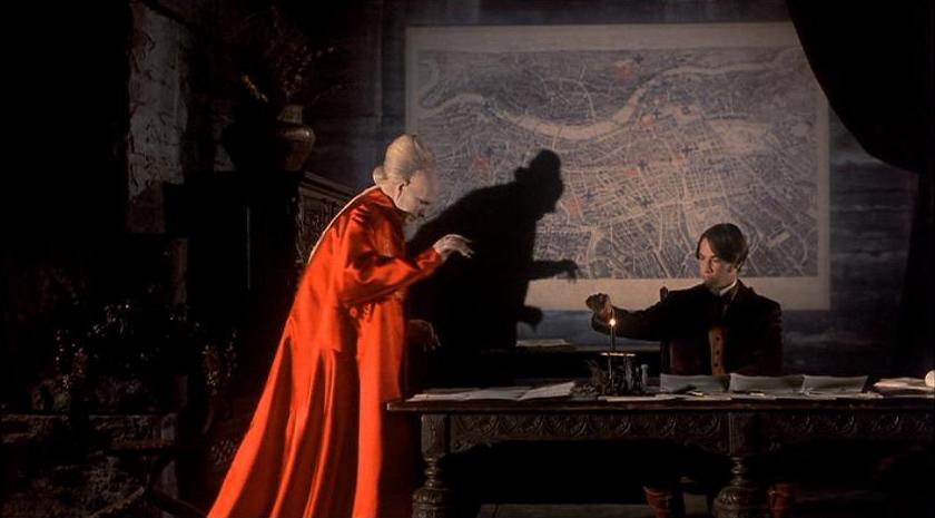
But I’m here to rave about the only nominated category that the film didn’t win. Production designer Thomas E. Sanders and art director Garrett Lewis were nominated, but they lost to Howards End. Hard to argue with that, of course. Yet their work on Bram Stoker’s Dracula is just as worthy in its complexity, engaging with the material deep within the extravagance and color. Sanders and Lewis demonstrate a creativity well beyond the Gothic castles and thick cobwebs of the genre’s lesser films, shining a newly bloodstained light on this most famous of vampire stories.
The home of the monstrous count itself is a perfect example. Dracula lives in a decaying tower, but a fraction of his former seat of power. It hovers over a cliff in a remote corner of Transylvania, all but removed from the eyes of the living. It cascades upwards, every story more mangled than the last...


