Oscar History
Film Bitch History
Welcome

The Film Experience™ was created by Nathaniel R. All material herein is written by our team. (This site is not for profit but for an expression of love for cinema & adjacent artforms.)

Follow TFE on Substackd

Powered by Squarespace
Keep TFE Strong

We're looking for 500... no 390 SubscribersIf you read us daily, please be one.  

I ♥ The Film Experience

THANKS IN ADVANCE

What'cha Looking For?
Subscribe

Entries in The Furniture (140)

Monday
Mar062017

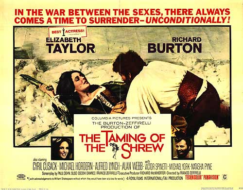
The Furniture: A Scenery Buffet for the Battling Burtons

Editor's Note: "The Furniture" is our weekly series on Production Design. We strongly suggest going forward that you click on the images to see them in their more detailed large glory. Many older films were of course designed for giant screens, not thinking of their eventual home as phones or small TV set. 
by Daniel Walber

 Franco Zeffirelli is not a man of subtle tastes. When he’s lucky, his opulent excesses achieve camp status. But when he’s not, it rolls over the audience like an 18-wheeler full of circus elephants. This has generally been the rule for his theatrical productions, some of which have nonetheless become war horse mainstays at major opera companies.

And so it may come as something of a surprise that the director’s overzealous artistic passion actually works quite brilliantly in his film version of The Taming of the Shrew, which opened 50 years ago this week. It turns out that his style is perfect for the frenetic madness of William Shakespeare’s screamiest comedy, heightened to a fever pitch by the deafening roars of Elizabeth Taylor and Richard Burton.

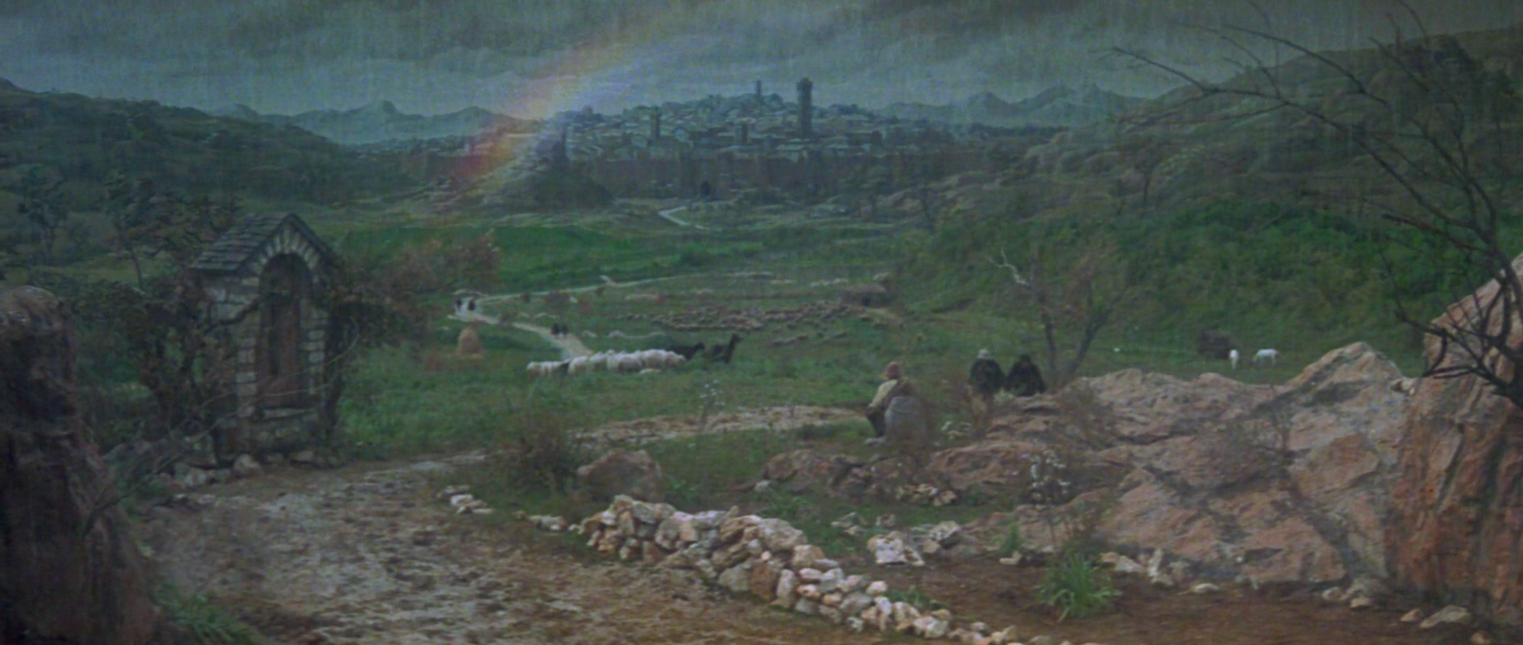
The setting is Renaissance Padua, introduced by way of a delightfully pastoral matte painting. Not content simply with a city in the rain, Zeffirelli showcases a rainbow. Two-dimensional sheep mingle with their three-dimensional, breathing brethren...

Click to read more ...

Monday
Feb272017

The Furniture: Another Art Deco Oscars

"The Furniture" is our weekly series on Production Design. Here's Daniel Walber with a special Oscar ceremony episode. 

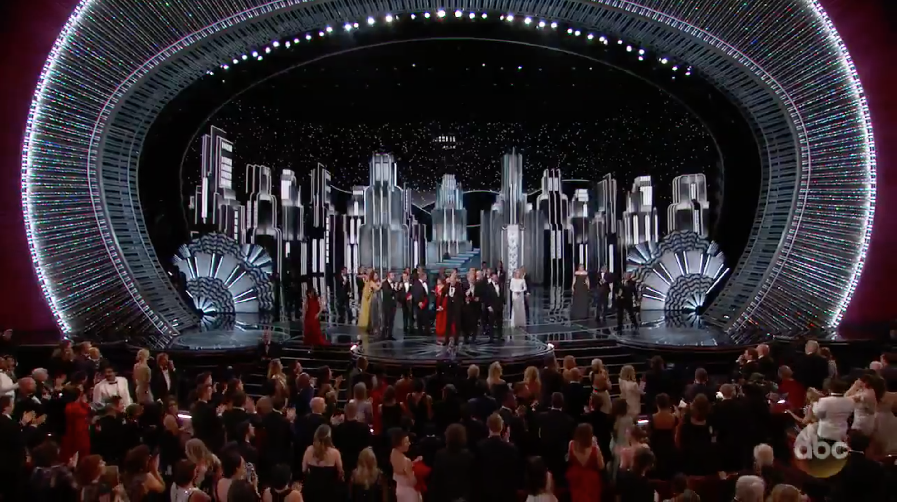
The following is an image of the 89th Annual Academy Awards, taken from the craziest moment of the broadcast. You know the one.

I am not here to talk about the Best Picture Situation, however. Instead, I’d like to draw your attention away from the drama and toward the shining Art Deco Gotham City/Metropolis that looms above it.

Since the Millennium, Oscar ceremony set design has been dominated by a few trends. I know this because I spent last week analyzing every televised set in Academy history. You can trust me. This year was very in tune with the past decade, with the notable exception of the “Classy Spaceship.” Thank heaven for that. If you don't know what I mean, here's a still of Jon Stewart being slowly released from a tube back in 2008...

Click to read more ...

Monday
Feb202017

The Furniture: A Canadian Air Show in Captains of the Clouds

"The Furniture" is our weekly series on Production Design. Here's Daniel Walber...

The United States may have entered World War II late, but American studios didn’t wait nearly as long to start making propaganda. Hollywood produced a number of pro-Allied films before the American entry into the war, from A Yankee in the RAF to the comparatively subtle Sergeant York. Though this ruffled some feathers in Washington, the debate became moot in December of 1941.

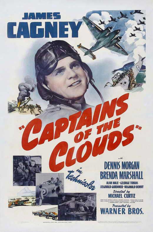
Captains of the Clouds falls right on the cusp, shot before Pearl Harbor but released in February of 1942. The film, directed by Michael Curtiz, was intended to drum up support for the Canadian war effort. The first major Hollywood production to be shot north of the border, it’s a technicolor extravaganza starring James Cagney and the Royal Canadian Air Force.

It also received two Oscar nominations. Sol Polito was recognized in the Best Cinematography category for the film’s breathtaking aerial sequences, a no-brainer. 

The nominated work of art director Ted Smith and set decorator Casey Roberts, however, is less flashy...

Click to read more ...

Monday
Feb132017

The Furniture: Lost in Space and Time with "Passengers" and "Arrival"

"The Furniture" is our weekly series on Production Design. This is the second of two columns discussing this year's Oscar nominees. Here's Daniel Walber...

On the surface, Arrival and Passengers appear to be the most similar of this year’s Best Production Design nominees. They’re both science fiction films set in the near future. Yet the similarities end there. Passengers is set entirely on an extravagant, colorful spaceship. Arrival splits its scenes between the interior of a minimalist UFO and densely packed military tents.

There is also one more essential difference...

Click to read more ...

Monday
Feb062017

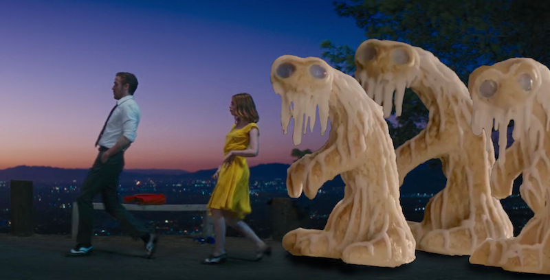
The Furniture: Magical Unreality in "La La Land" and "Fantastic Beasts"

"The Furniture" is our weekly series on Production Design. This is the first of two columns discussing this year's Oscar nominees. Here's Daniel Walber...

At a pool party in La La Land, Mia (Emma Stone) is granted the unique misfortune of being introduced to a generic Hollywood screenwriter. “I have a knack for world-building,” he says, instantly conjuring spectres of a Game of Thrones economy. Mia quickly extricates herself, destined for a different man in love with his own talent.

The moment is fleeting, but it peels back the curtain on Damien Chazelle’s own view of world-building and filmmaking. His version of Los Angeles isn’t at all overstated, with the exception of its ever-present automobiles. The characters don’t quite inhabit an identifiable city. Rather, they exist against a backdrop of imagined Hollywood, built from relentlessly colorful skies and busy studio lots...

Click to read more ...