Oscar History
Film Bitch History
Welcome

The Film Experience™ was created by Nathaniel R. All material herein is written by our team. (This site is not for profit but for an expression of love for cinema & adjacent artforms.)

Follow TFE on Substackd

Powered by Squarespace
COMMENTS
Keep TFE Strong

We're looking for 500... no 390 SubscribersIf you read us daily, please be one.  

I ♥ The Film Experience

THANKS IN ADVANCE

What'cha Looking For?
Subscribe

Entries in The Furniture (140)

Monday
Nov072016

The Furniture: Terrestrial Fun in "Star Trek Beyond"

"The Furniture" our weekly series on Production Design. Here's Daniel Walber

Early in Star Trek Beyond, screenwriters Simon Pegg and Doug Jung wedge a dumb joke into the voice over narration of Captain Kirk (Chris Pine). He has led the Enterprise and its crew across the galaxy to fulfill an endless series of missions, many of them quite similar. His life, he explains, has begun to feel a bit “episodic.” Very funny.

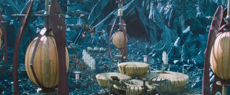
Yet Star Trek Beyond is, in its own way, a self-contained episode of an ongoing series. The bulk of the film takes place on a single planet. No time is spent on earth, nor is the home world at any significant risk. There is no massive cross-galaxy conflict. The story is given a satisfying conclusion, without participating in a grand trilogy or teasing a far-off sequel. This isn’t Star Wars or, for that matter, the Marvel Cinematic Universe.

This means that the production design team, not tasked with a universe of diverse locations, focused on on just a couple of planets...
Click to read more ...

Monday
Oct312016

The Furniture: Feasts of Flesh in Pan's Labyrinth

"The Furniture" our weekly series on Production Design. Here's Daniel Walber

Pan’s Labyrinth, like most of Guillermo del Toro’s films, is busy with visual imagination. There are monsters and fairies, though it’s not always certain which is which. There are dramatic colors and haunted shadows, which push even the more terrestrial sequences toward the fantastical. And there are little flourishes, not all of them thanks to the digital effects team.


In fact, physicality is among the film’s greatest strengths. Sets were built for both Ofelia’s dream world and the all-too-real Spanish Civil War narrative that frames them. Del Toro doesn’t rely on either digital backgrounds or pre-existing locations. Instead, he leans on the uncanny power of tangible design, like these Harryhausen-like models that stand in for an underground kingdom.

Click to read more ...

Monday
Oct242016

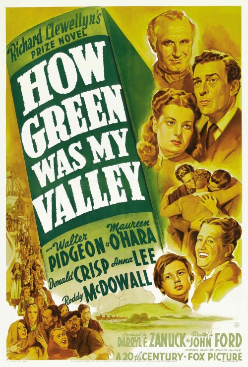
The Furniture: Designing Dignity in "How Green Was My Valley"

"The Furniture" our weekly series on Production Design. Here's Daniel Walber

Filmmaking is often an art borne of flexibility. Tim Burton built Sleepy Hollow from scratch when he couldn’t find just the right town in the real world. Vincente Minnelli was forced to make Brigadoon indoors in Hollywood, because the studio wouldn’t pay for an expensive production in Scotland. Both films are likely better for it, too.

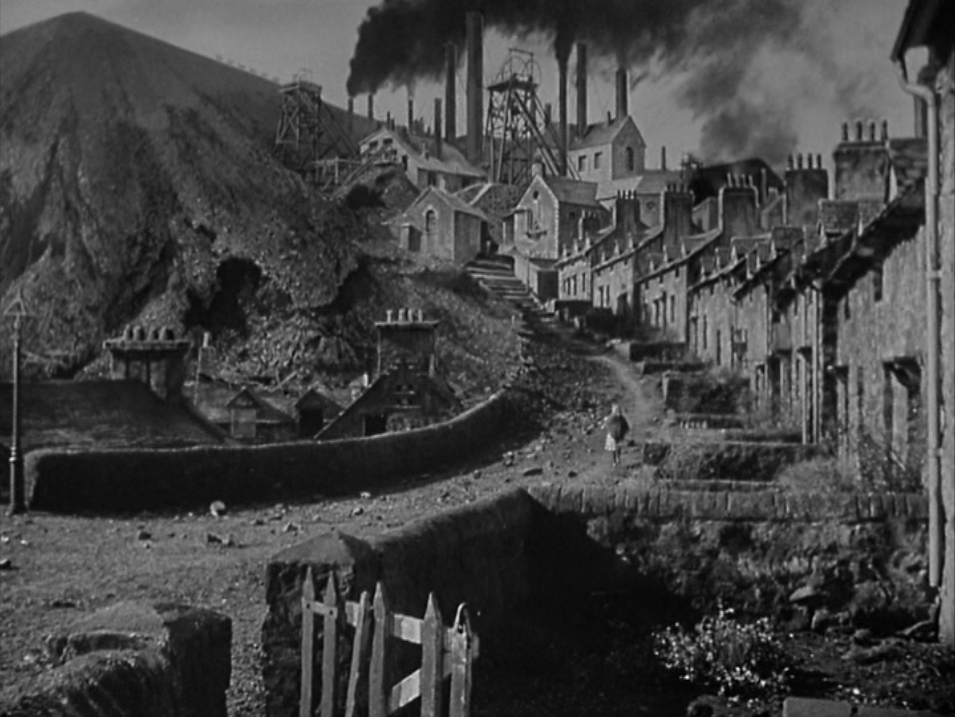
The same is perhaps true for How Green Was My Valley, which premiered 75 years ago this week. John Ford wanted to make shoot it on location in Wales, but World War II intervened. Instead, the production team built an entire mining town in the Santa Monica Mountains. This condensed and idealized version of the setting of Richard Llewellyn’s 1939 novel is among the most emotionally resonant sets of its era.

The film won five Academy Awards, including Best Picture and Best Art Direction.

The design team consisted of Richard Day, Nathan H. Juran and Thomas Little, no stranger to Oscar success. They based their village on Gilfach Goch, a quintessential Welsh mining town, but they dramatically reduced the size and jammed the houses much closer to the colliery...

Click to read more ...

Monday
Oct172016

The Furniture: The Shrieking Color Scheme of Ghostbusters

"The Furniture" is our weekly series on Production Design. Here's Daniel Walber on Ghostbusters, just out on DVD and Blu-Ray

Paul Feig movies tend to be about comic excess. There’s always a nearly too much humor jammed in, not infrequently with the side effect of a bloated running time. To be fair, there would be more time for Melissa McCarthy and Leslie Jones to adlib about dancing if Ghostbusters weren’t also required to have a number of standard narrative beats, but that’s Hollywood.

The point is that Ghostbusters, like Spy, displays a remarkable dedication to extravagant nonsense. Its excessive approach, pushing every joke as far as it can go, is also true of its design. Production designer Jefferson Sage, Oscar-winning set decorator Leslie A. Pope (Seabiscuit) and the rest of the design team provide a a unifying absurdity in both color and texture that keeps Ghostbusters on a collision course with comedy...

Click to read more ...

Monday
Oct102016

The Furniture: A Nightmare in Sleepy Hollow

"The Furniture" our weekly series on Production Design. Here's Daniel Walber...

Sleepy Hollow is an excellent October movie. It has well-placed jack-o-lanterns. Every frame shivers in the autumn chill. Washington Irving’s Hudson Valley falls under perpetually overcast skies, sapping the harvest season of its color. Rather than admire the changing leaves, Tim Burton emphasizes those aspects of fall that foreshadow the bitterness of winter. 

This harsh climate swept up three Oscar nominations, including a win for production design. It’s a testament to Burton’s fanatically specific vision. Location scouting began in Irving’s New York, but the perfect town wasn’t there. It wasn’t in New England, either, nor even in Old England. After all of that searching, the design team ended up building an entire 18th century village from scratch at Leavesden and Shepperton Studios in the UK.

The final product is an expressionistic, spooky riff on colonial life. The credit goes to production designer Rick Heinrichs, whose collaboration with Burton goes as far back as 1982’s Vincent. The set decorations were by Peter Young, who first worked with the director on Batman. Their version of Sleepy Hollow, New York is a clever blend of historical realism and nightmarish fantasy...

Click to read more ...