The Art Direction I Live In
 Thursday, January 26, 2012 at 9:49PM
 I always try to finish the "Oscar Categories" of my own Film Bitch Awards before the Oscar nominations. I was racing to the deadline, panting heavily, sweating profusely and then I collapsed. I am now crawling towards the finish line. If anything can revive me it's eye candy! So here are my nominees for Art Direction and Cinematography. I would post Costumes too but I'm still arguing with myself over 8 films. (So many worthy efforts!)
But while I have your eyeballs, I want to talk about one film in particular. Film is a visual medium so you'd think it would be a given that filmmakers would convey their themes and moods and characters visually. But many of them don't, relying on dialogue as exposition or voiceover profundities or leaning heavily on the gifts of their actors to get themes and nuances across. In other words, we have too few Pedro Almodóvars behind the camera.

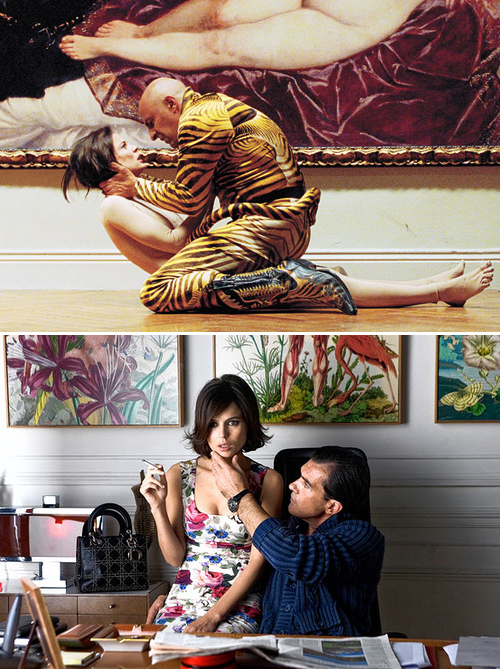
In the two stills above from The Skin I Live In (which went without any Oscar nominations and was not submitted by Spain for Best Foreign Film) you can see how visually rich and how carefully planned every beat in an Almodóvar film is [MORE AFTER THE JUMP]
The characters are reflected in their environments and vice versa. And yet they never feel like they're reaching for effect. Pedro has a great collaborator in production designer Antxóm Gómez who won a European Film Awards nomination for this art direction. But sadly no American awards traction followed.
In the first still we have a rape scene happening in front of a painting of a nude seductive woman. It's an unnerving juxtaposition on a number of levels (no spoilers here). I didn't notice it on first viewing -- I sometimes think awards season should happen a few years after the movies sink in -- but the sheet that the nude woman is lying in on the painting, well, a similar color repeats on the bedding where another sex scene takes place. In the later scene Vera Cruz (Elena Anaya) is more or less prepared to seduce but maybe this subconscious echo of color is helping to remind us that nothing that's happening in this movie is ever consensual in the purest sense which adds to the pervasive anxiety. It's possible that I just made up this connection and it was accidental but great movies allow you to free associate like that and pull you in ever deeper.
In the second still, you see the Dr. Ledgard's (Antonio Banderas) office. He's a plastic surgeon so the painting with the stripped musculature (which served as the teaser poster) is reflecting his profession but notice how Vera's dress is also reflected in the other painting; they're both his possessions.
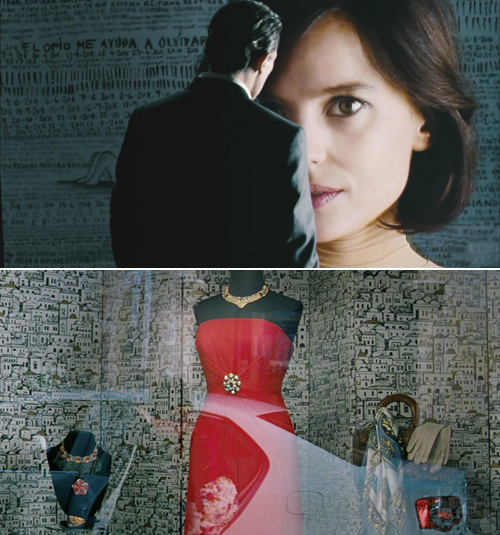
The juxtapositions aren't always that obvious. Look at these two stills...

The first image is Vera's prison... uh, I mean room (!) with Dr. Ledgard observing her with fascination as he often does. Those scribblings on the wall are Vera's own creation. The window display in the second image is also related to Vera but this time it's Vera herself gazing (she's about to be reflected in the window). The backdrops aren't dissimilar to the eye but instead of Vera's scribblings we have what looks like a hand-drawing of an entire city. It's a sea of rooms where people might be living. People who aren't Vera.
Brilliant.
Every year I'm tempted to expand the eye candy categories into 10 nominees or split them into period/fantasy and modern since there's so much in the way of rich deserving work by real artists out there that goes under congratulated each year. But for now a few words and as always I love to hear your opinions. Which eye candy onscreen really elevated the movie for you?
My nominees for ART DIRECTION & CINEMATOGRAPHY
With honors for Jane Eyre, Drive, Tinker Tailor Soldier Spy, The Artist and more...


Reader Comments (18)
Drive's cinematography is so awesome! Should be totally nominated! And how could Academy totally forget about The Skin I Live In?? Is the best film from Almodovar in years!
Still waiting for supporting actress...!!!
I love that you've included both my favourites in these categories.
The Skin I Live in is unparalleled this year in art direction. Even when he's not going for obvious character creation or mood reflection in the design, it just looks absolutely beautiful to look at. The interior of his house with those hanging lights, for instance, is exemplary.
And in the cinematography category, there's Melancholia and I honestly think that's a bigger snub at the Oscars than Dunst. Von Trier's work is always visually enticing even when I don't like the film as a whole but Melancholia just tops anything he's done in my opinion.
I wish I could say those were great choices, but from the Art Direction list I've only seen Tinker Tailor, unfortunately (The Artist is next, finally!). And I agree, Melancholia, Drive and The Tree of Life were gorgeous and the first two definitely deserved more recognition. I'm also in love with the visuals from War Horse.
Those were really excellent observations! Now, I have to watch the movie after reading this.
My favorite cinematography I've seen this year is Bal (Honey), from Turkey. It won the Golden Berlin Bear a few years back but it only came out in the states this year. One of the most beautiful looking films in a REALLY long time, as far as I'm concerned.
No one beats Almodovar in terms of genius for creating bold Movie Movie images. Even in his sort-of minor films like Skin I Live in (which still sits comfortably within my Top 10 for the year), he proves this roughly every 14 seconds. I especially loved all the silent-serials homaging and every single image involving that skin-suit.
(Also - I don't much notice Banderas most of the time, but within Almodovar movies, even at this age he's still freakishly hot.)
The staircase scene in "The Artist" was filmed at the famed Bradbury Building. The same stairs can be seen in "Blade Runner," "500 Days of Summer," "Pushing Daisies," among others.
You know Almodóvar doesn't like art directors. I remember an interview in which he dais he had made 16 movies with 16 different art directors. He is never satisfied with them, and made a scene in Broken Embraces just to state this. He is a perfeccionist.
It's strange he said this (I can't find the link now) since Gomes has worked with him a few times.
Here:
“The reason is not just out of stubbornness or whim. It’s the area that gives me the hardest time. I’ve shot 17 films with 17 art directors. Basically, we don’t understand each other.”
http://hollywoodandfine.com/interviews/?p=569
“I decorate my own sets, starting with the walls and floors. I think of myself almost as a painter. It’s very instinctive. I have ideas and theory and ultimately it’s intuitive. Then I have five different chairs brought in and other furniture to see which works. I change it around so it works with my own palate"
See? Maybe Almodóvar should get a FB nomination, uncredited.
Love these observations about The Skin I Live In - subtle things which I didn't pick up on myself, so it's fascinating to see. What did stick in my mind about the film was the vivid construction and colour of the images - and costume in particular, actually, so I hope it's in contention there.
Fantastic choice in Jane Eyre - I was reminded of the cinematography when I saw Andrea Arnold's Wuthering Heights, which has a much wilder take on the same sort of settings. Jane Eyre's control and delicacy seemed retroactively even finer afterward. (Not to discredit WH - they are different cinematic creatures.) And Captain America - such a fizzing, joyful world that seemed both a recreation and a fantasy at once. (Can't get on board with Hugo, though I did like Melies' glass studio.)
1. The cinematography category is sick, isn't it? I'm annoyed at the Finalists not making it, but I look at the five and can't convince myself there's room. And that's without Uncle Boonmee, How I Ended this Summer and every other film I haven't seen.
2. Great category for Art Direction.
I LOVED the house in The Skin I Live In...so chic. Pedro has impeccable taste.
I figured you would go for the visuals of Certified Copy. I guess not. I thought the art direction was a third lead character in that film.
Sweet! Especially love your write-ups for HUGO, DRIVE and CAPTAIN AMERICA!
My Picks…
Best Cinematography:
THE ARTIST, Guillaume Schiffman
DRIVE, Newton Thomas Sigel
MELANCHOLIA, Manuel Alberto Claro
RAMPART, Bobby Bukowski
THE TREE OF LIFE, Emmanuel Lubezki
Best Art Direction:
THE GIRL WITH THE DRAGON TATTOO, Donald Graham Burt
HARRY POTTER & THE DEATHLY HOLLOWS PART 2, Stuart Craig
HUGO, Dante Ferretti
THE SKIN I LIVE IN, Antxon Gomez
TINKER TAILOR SOLDIER SPY, Maria Djurkovic