Nitpicking The Oscar Packages
 Wednesday, March 1, 2017 at 1:00PM
 by Glenn Dunks
I think for the most part we have been quite complimentary towards this year’s ceremony, yes? From its typically lush art deco set and its effectively-staged musical numbers to the surprisingly adept Jimmy Kimmel as host. But you’ll have to forgive me a few minutes while I nit and I pick at the one part I feel like they flubbed: the craft nominee packages.
Let's take a look...
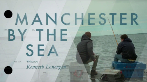
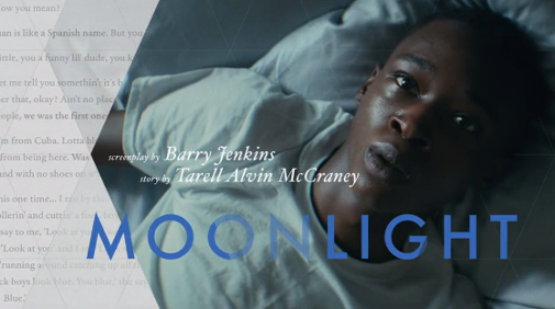
Perhaps befitting how little people are going to remember them in the aftermath of what will ironically go down as the most memorable Oscar ceremony of a generation (of all time?), the packages felt like afterthoughts. Despite frequent calls to move technical categories to a separate event, the producers usually do a solid job of contextualizing the nominees and elaborating on the filmmaking process. This year's ceremony, however, did not. Instead they preferred to use a recurring triangular motif that was consistent but lacked pizzazz.
The Screenplay Presentations
One of my favourite bits from any Oscar ceremony is when the presenters of the screenplay categories say “Interior” (or, you know, “Exterior”) and proceeds to read the mechanics of a screenplay that most of us never see. It shows off the craft of writing in a succinct way leading to a word or a phrase or an exchange that audiences can then directly correlate to a person having personally sat down and typed. It's minor, but often a nod to movies being more than just actors and directors.
They don’t always do this, true, but I was disappointed in a year of nominees with such great dialogue, original plots, and noteworthy history that the nominees didn’t even get the slightest bit of description. Audiences unfamiliar would have no idea what The Lobster or 20th Century Women are, or that August Wilson wrote his Fences screenplay before his death in 2005.
The Costume and Production Design Presentations
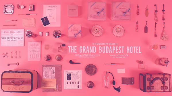
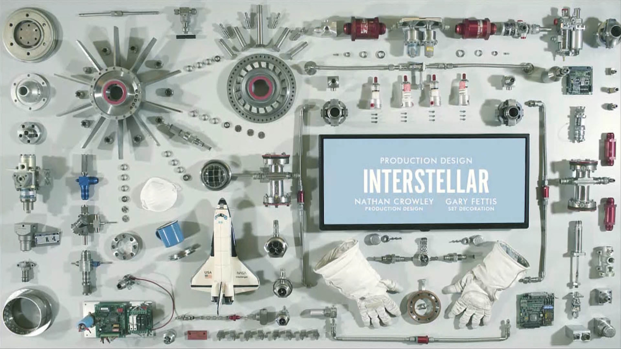
It’s always going to be hard to top the 2015 ceremony’s absolutely gorgeous production design title cards that intricately laid out props, decorations, and miniatures amid a design-appropriate setting.
But just because you’ve reached the apex once, doesn’t mean you should just stop trying. There are so many ways to enliven the presentation of these categories, particularly to audiences who might suggest they don’t know what they mean or why they should care. This year’s nominees were presented as just clips from the films with no sketches, behind-the-scenes construction, or design detailing. Of the nominees, only Passengers really got images that highlighted the work in clear detail.
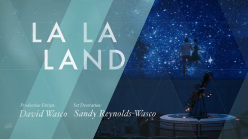
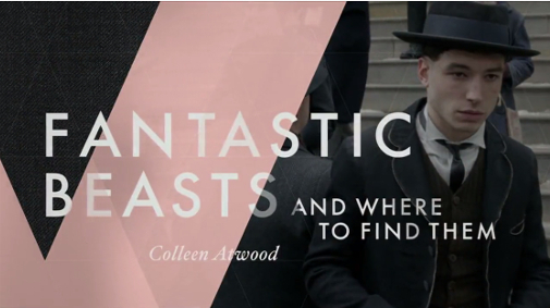
Likewise costume design. With its nominees across period and contemporary, fantasy and reality, famous recreations and lavish originals, there was so much to work with and instead all viewers got were, yet again, clips. Where were the sketches (like these) of those La La Land primary color outfits? Where were the statistics about how precise the Jackie recreations were or showing how they ever-so splotched the famous pink Chanel with blood? Or how Fantastic Beasts used mingled the 1920s with Harry Potter? Not only visually disappointing, but there was no differentiating between what each package was actually for.
The Sound Presentations
Yet again, it must be hard to come back to a category knowing you aced it one year earlier, but 2016’s presentations were perfection. Isolating the horse power of Mad Max: Fury Road, the bouncing bolts of The Martian and the bass-rumbling gun shots of Sicario against the growl of Star Wars' Chewbacca and The Revenant's pounding hooves in the sound effects editing presentation was particularly clever and was a ceremony highlight for a category the producers often don’t really know what to do with.
So why then, considering they brought back Chris Evans to present the categories again (is he now to the sound categories what Cameron Diaz once was to animated?), didn’t they just re-do what they did last year? They did as good a job as could conceivably be done in a single minute to explain the process and the minutia of the craft. The sounds they did choose were mostly chosen well: the whirring of the gunship cannons of Hacksaw Ridge, the foreign alien sounds of Arrival and the freeway radio signals of La La Land, but these intricate details as well as the more generic explosive sounds of Deepwater Horizon and Sully got more or less lost underneath Evans’ reading of the nominees and audience applause.
Next year’s producer needs to watch Berberian Sound Studio and find some fun ways to show off these categories again.

So what did you think of the packages this year? Disappointed or am I alone here?


Reader Comments (11)
At least they used Futura—their font game is still on point. Otherwise I have to agree: less tour bus, more presentation please.
Paul Outlaw: I'd argue that every movie should maybe have individually chosen fonts for Oscar presentation, but Futura's one of the better choices from an "omni font" perspective. How cool of a joke would it have been to have Arrival start with Futura and then convert to one of the Alien fonts over 10 seconds?
Got me thinking...will the ceremony still get Emmy attention despite the mix-up? I know PwC took the fall, but it's still an aspect of ceremony production that went very wrong. From a showbiz standpoint, the executive producer is where the buck stops for any snafus like that.
The part of the night with the most entertainment value was a massive production glitch.
My guess is that everybody still gets Emmy nominations. But it raises a question about the value of spectacle vs. clean/intentional production aspects.
I also would have liked something more informative in Makeup-I liked the "this is why we're nominating you" cards of the past in this regard.
Agreed on all counts. But I haven't seen anyone mention the lovely introductions to the acting categories showing past winner announcements and bits of speeches. I really loved that. Except that Emma Thompson got barely a split second. Rude.
And perhaps in the future they can have celebs talking about the craftwork of a past winner that they really loved like they did with the presenter pairings this year.
How about including a bit that explains which each category actually is before going through the nominees? I know that the presenters are meant to tee up the nominee packages, but they almost never do a good job of explaining which each craft is (esp Sound Mixing vs Sound Editing). It would be great to have an expert in a field give a quick definition of what they do and what the challenges are.
Example:
- Have a brief Sound Mixing package where Kevin O'Connell explains what sound mixing is. End the package with O'Connell saying "And here to present this Oscar for Achievement in Sound Mixing is Chris Evans and Sofia Boutella."
- Chris and Sofia are already on stage (no wasting time walking out). "We're proud to present this years Oscar for Sound Mixing. Each nominee yada yada..."
- Traditional nominee package.
- Award presentation.
(Repeat for most other categories with an expert in that category, a previous Oscar winner if you can swing it, so you can start the package with a brief clip of them accepting their award.)
Considering there was a time not long ago where these "packages" didn't even exist, I can't complain too much.
Why can't they just repeat what they did last year or the year before? Joe Sixpack and Sally Housecoat (TM Mr. Burns) won't remember that they saw the same style of intro every year.
Yeah, I agree that the design from the 2014 ceremony was the gold-standard overall in every category... except the Screenplays which albeit good are always made more awesome when we have a narration of the script, like last year.
By the way, have you seen the interview by the chief designer for the 2014 ceremony?
It's amazing :)
http://www.artofthetitle.com/title/87th-academy-awards/
Lol -- they do have an awesome font game.
I had forgotten about the sound effects clips from last year. That was so awesome now I'm upset they didn't do it again.
I actually served this purpose at the Oscar party I was at.. every tech category, people asked me to explain what production design, sound mixing, etc was.
Some of these critiques are valid. But I really appreciated all the old clips from past winners being shown with the presentation of the acting awards. They should do this every year. This is why we love the Oscars!