Thoughts I had... while staring at new movie posters
 Friday, September 27, 2019 at 12:01AM
 You know how this works. Thoughts as they come without self-editing...
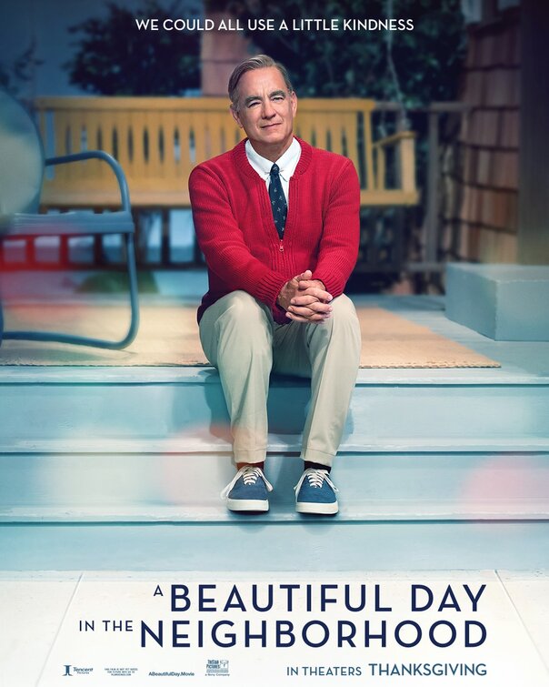
• We could all use a little kindness" is a good tagline. Because, if A Beautiful Day in the Neighborhood is one of the nicest movies you'll see this year. Please don't read that as a dismissal. "Nice" and "Kind" are holy adjectives when they're said with truth and not as shorthand for anodyne comforts.
• The soft focus is maybe overkill on the poster because the movie isn't soft. It's just kind.
• Are people going to reject this movie once they realize that it's not really about Mr Rogers, because the poster is false advertising in that way. Not a biopic!
• Those clothes look like they've never been worn before but also comfy which is an oxymoron.
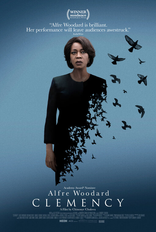
• 🎵 You only see what your eyes want to see
How can life be what you want it to be
You're frozen when your heart's not open
You waste your time with hate and regret
You're broken when your heart's not open
Mmm, mmm, if I could melt your heart
Mmm, mmm, we'd never be apart
Mmm, mmm, give yourself to me
Mmm, mmm, you hold the key 🎵
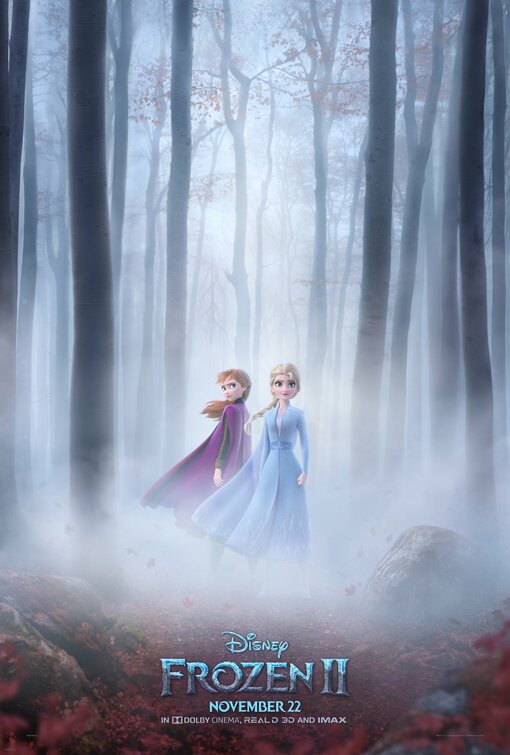
• "Do you want to build a snowma🎵"... needlescratch. This doesn't look very wintry. Frozen II: The Fog
• Speaking of somber, this poster is trying to hard to look mythic and serious, yes? You know there will be Olaf hijinx and probably other goofiness. Stop lying to us Disney.
• Elsa got all glittery for her coming out ball in Frozen but she's dressed very demurely again. Hmmm. That means no girlfriend for the Queen.
• If they don't give Jonathan Groff a song this time we are going to riot. He's only one of the best musical stars. It's like the modern equivalent of when Barbra Streisand cast Mandy Patinkin in Yentl and then didn't let him sing.
• I still have nightmares about that garbage Frozen short Frozen Fever (2015) and avoided Olaf's Frozen Adventure (2017) like the plague so hopes are not high.
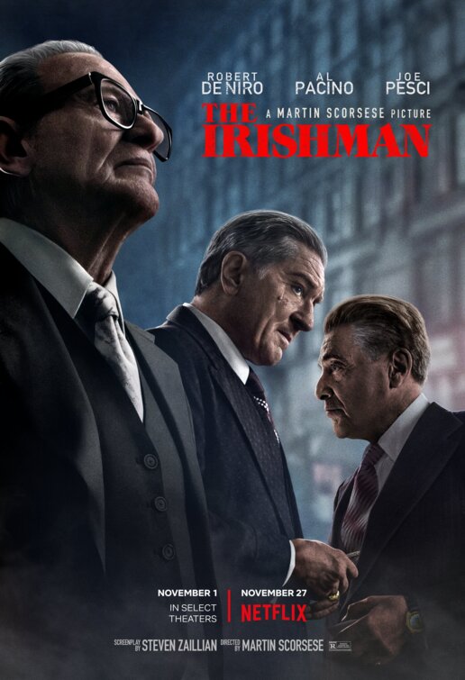
• Kinda dig the diagonal composition of the poster.
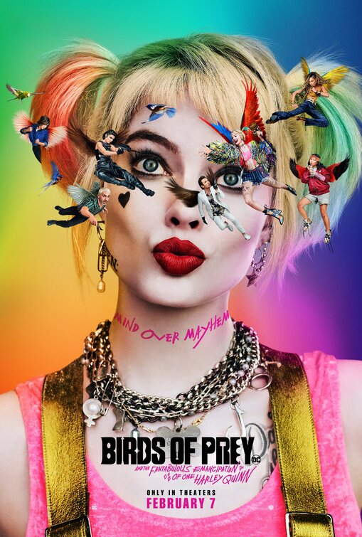
• ... like when cartoon characters hit their heads and see birds... but in this case Harleyquinn doesn't need a concussion to see herself and other characters floating around her because she's batshit crazy.
• The full title of this is kind of awesome Birds of Prey: And the Fantabulous Emancipation of One Harley Quinn but can we talk about how annoying it is to have a colon franchise title followed by an "And"... drop the colon and it reads better but they're already presuming lots of sequels that need the branding up front.
• Remember when Suicide Squad won an Oscar? HAHA
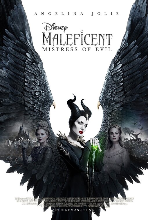
• Given audiences sheep-like behavior around Disney films, wouldn't it be weird but also not shocking if this flopped?
• Prefer this poster, naturally
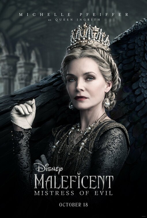
• Though in truth the stark background white with the black wings is a good visual read for a movie poster which are meant to convey their entire movie with a singular memorable image and the really transcendent posters (not that this is one) end up being iconic for their ability to do just that.
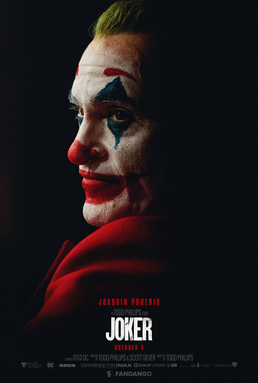
• Trying to go into this movie with an open mind but already feel oversaturated by it.
• The posters have been good though. Their bold colors (as above) and hard compositional lines (not this one so much but some of the others) work pretty well at being unsettling .
• The lip work makes us long for Dina Martina's take on this role.
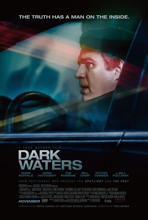
• "The truth has a man on the inside" ... someone got paid well to write that hokey tagline.
• What's with this new trend of photographic posters that look like illustrations without being illustrations they're so airbrushed without any attempt at looking like unaltered photos?
• Annoying that "A Todd Haynes Film" is less visible than the production company that brough you "Spotlight and The Post" but maybe that's better for Todd Haynes since this appears to be (at least in trailer form) the only time in his entire career when he hasn't been himself and is just a journeyman director for hire.
• Undecided on whether this poster is cool with its triangular drama and weird color streaks or awful in its vaguely sinister photoshopped way. Help me to decide.
• Missed opportunity that Jennifer Connelly isn't in this...


Reader Comments (38)
Ha! If Dark Water had been successful, would its sequel have been called Dark Waters? Or rather Darker Water? Then Darkest Water? ("I couldn't help but wonder...")
Ha! If Dark Water had been successful, would the sequel have been called Dark Waters? Or rather Darker Water? Then Darkest Water? ("I couldn't help but wonder...")
Are the days of “floating heads” almost over?! They have been fewer and fewer anymore. Thank God!
At first look doesn't Ruffalo look like Antonio Banderas in the Dark Waters poster!?
OMG I totally forgot SUICIDE SQUAD won an Oscar. Damn!
Al Pacino looks like he's having fun in the new trailer for THE IRISHMAN. The rest... don't.
I was indifferent to CLEMENCY till I saw that trailer and now I'm mad they're releasing it so late because Alfre Woodard looks like she deserves all the awards for it.
I would not be surprised if MALEFICENT underperforms, like DUMBO did earlier in the year. Surely people don't go to see movies *just* because they're Disney.
Glad I'm not the only one to be continually reminded of the Jennifer Connelly DARK WATER when I hear about DARK WATERS. Was that the best title they could come up with? I love Haynes & Ruffalo but that poster and tagline are awful. What does the tagline even mean?!
When is the narrative about the fact that Hanks does not sound or look ANYTHING like Mr. Rogers going to kick in? Is he just gonna get a pass because he is Tom Hanks? He does not sound or look AT ALL like the person he is playing.
I'm a bit tired of these spin offs from films no one liked.
I quite like the Clemency poster but it certainly doesn't look like Holiday fun.
I feel like i've seen Joker,why is that?
I'm not familar with the Tom Hanks person,so i'll have nothing to go on but his performance and hasn't he been a bit undervalued and undernominated for nearly 20 yrs.
Homer is the best. The poster and probably the movie.
Horrendous
Mark Ruffalo just looks unnatural on that Dark Waters poster. It's disturbing, and somehow I don't think that's what the studio was going for.
@Michael R - I thought he looked more like Ray Liotta.
@Charlea, who does look or sound like Mr. Rogers? Gary Oldman doesn't really look like Winston Churchill, Meryl Streep doesn't look like Julia Child, Rami Malek doesn't look or sound like Freddie Mercury, etc., and those turned out OK (well, except for Bohemian Rhapsody, but that's another story). Mimicry is one thing, but being an actor isn't the same as being an impersonator. That's why you tend to find the latter onstage in Vegas—not onscreen in Hollywood.
I feel like Hanks looks and sounds as much like Mr. Rogers as Zellweger looks and sounds like Judy Garland.
I was sure they'd bring Clemency to our local film festival, but they're not even doing that. I'm disappointed that Neon isn't doing more for Alfre.
I hope Birds of Prey dont destroy the joy of the original Suicide Squad. It was so good.
I'm very excited about A Beautiful Day in the Neighborhood but when I look at that poster, all I see is EYEBROWS.
Here is your decision on the Dark Waters poster: Sucks.
I'm excited about everything to do with Beautiful Day in the Neighborhood except for Tom Hanks. Not that I don't think he'll be excellent, but isn't this casting a little too on the nose?
He's great in The Kids Are All Right and You Can Count on Me but I really can't stand Ruffalo in most things. He has such an annoying, tentative presence and I cringe when he goes "big." In wonder how much of his assumed "talent" was just lucky casting,.
Will be interesting to see how special Dark Waters is. With Haynes there are sure to be some grace notes and style choices that most directors wouldn't bring to the material. But it looks like the least special movie he's ever made. Or at least it's being sold that way.
It looks like The Irishman is a real contender, but unfortunately not for Anna Paquin...
Baby food
Ruffalo was simply awful in Spotlight and his "big" scene was a study on how not to act emotions.
@Charlea, when you see the movie, you'll realize that doesn't matter. He gets the cadence and the spirit of the man just right, so much so that you'll feel Mr. Rogers speaking through Tom Hanks. The performance is THAT good.
Sorry. I mean Joker. I was sleepy and just right now I read what I typed. 😗
Nathaniel, please, after this you have to make and old movie posters post. Anyway, it seems like if they really don't care anymore. The movie poster as an art form is really dying.
I prefer the first poster from Joker.
Of these options, my favorite is Birds of Prey because the aesthetic refers to the cover of a comic.
The rest looks too photoshoped to my taste. I prefer subtle digital compositions like Brokeback Mountain
My favorite movie poster so far is Parasite
Can we talk more about movie posters?
Todd Haynes, I love you dearly but...... why?
Please give me another Oscar. I’m being honored at the Holden Hlobes with a Lifetime Achievement Award, so spread the love.
@Feline Justice
I don´t think that this art is dying, maybe some posters are poor but mostly are from mainstream movies.
Indie and arthouse films are good place to find interesting designs like the posters from Vasilis Marmatakis
They should let the web guys make this. Those "alternative posters of movies nominated for the Oscars", for example, are always better than the official posters. The best here is Joker, the worst is Clemency - a good Idea badly executed.
Nat -
I've read you in the past imploring the Academy to be more creative in their voting outside the Top 8 categories and not just divvy up the nominations among the same handful of Best Picture contenders. Welp, if that's your position - and it is a righteous one - no fair pointing and laughing when crap like Suicide Squad lands a deserving* tech win. Them's the breaks.
*Haven't seen Suicide Squad. I'm going on what I've heard about the makeup.
What is up with Tom Hanks' weird makeup and eyebrows? It's like they wanted him to look feminine to play Fred Rogers? Seems off.
Charlea - He doesn't look like Mr. Rogers and the voice isn't the same. But the cadence of his speech and the comfort behind the words are there... See the film and judge for yourself. I was skeptical before I saw the film and came out convinced that Hanks was absolutely the right man for the job.
Mark Ruffalo poster sucks. If that's the best they can put on a poster, film clearly dies not have much going for it. Ruffalo in a car? Lol
The only one I like is BIRDS OF PREY, although the other JOKER posters have been much better.
The poster for The Irishman is OK - shades of The Departed - but Netflix seem never to put the complete credit block on their posters (final posters; I don't mean teasers) and it makes their prestige films look like...TV shows.
I’d love to see Jennifer Connelly in a Todd Haynes film. Poster is a bit underwhelming but I love seeing ‘academy award nominee Alfre Woodard’ billed above the title. Team Alfre!
Michael -- you're absolutely correct. I stand wrist-slapped. At least the makeup branch was actually nominating for makeup and not "best picture" (as all branches should)
I really wonder what happened during the "Carol" awards season. It seems that, after their collaboration, Todd Haynes, Cate Blanchett and Rooney Mara have completely given up campaigning for their films and that they are taking offbeat roads career-wise.
Best: Joker
Worst: (tie) Clemency and The Irishman
Great Idea But...: (tie) Birds of Prey and Maleficent Mistress of Evil
The A Beautiful Day in The Neighborhood poster made me think Tom Hanks will play santa in a movie someday.