Curio: Movies By Color
 Monday, September 8, 2014 at 5:00PM
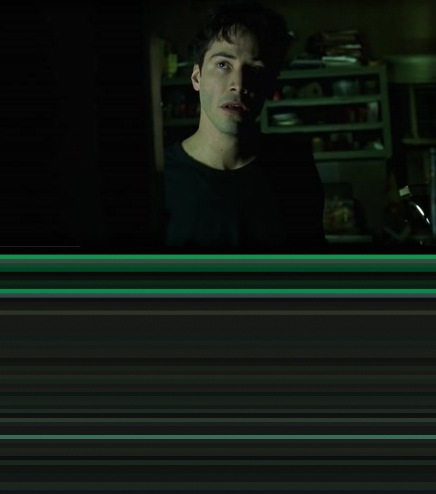
 Alexa here with your weekly fix of film art. I've always thought color impacts the mood of a film greatly: the pops of red in Pulp Fiction, the moody blue noir of Blade Runner, the dominant earth tones in The Big Lebowski. Along these lines, there has been a mini-trend lately of designers abstracting films according to their color palettes. My favorite is by designer Charlie Clark. Clark's project, titled "The Colors of Motion," takes the average hue from each frame of a film and then presents the frames together as horizontal stripes or square tiles. Distilled down to their palettes, The Matrix becomes a sea of green and black, and Frozen becomes a patchwork of dark blues and browns.

 Colorology,
  Curio,
  Frozen,
  The Matrix


