"The Furniture" is our series on Production Design by Daniel Walber. Click on the images to see them in magnified detail.
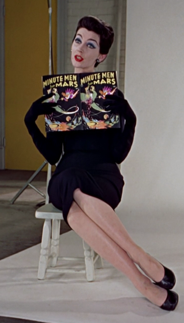
 Funny Face (1957) is not really a complicated movie, visually or otherwise. Its production design doesn’t express inner turmoil or repressive social structures, nor does it take the characters on any sort of elaborate journey. And in some scenes it’s downright boring, director Stanley Donen essentially stepping back to allow Fred Astaire and Audrey Hepburn room to dance.
But production design doesn’t have to be profound to be good, or even Oscar-worthy. And while I wouldn’t have voted for Funny Face for the Academy Awards, I do think it’s worth a look. Besides, its design does sort of have a message: that the opposite of fashion is books, and that any attempt to combine the two will lead to utter chaos. Is it serious? No, of course not, but it manages to be fun and chic at the same time.
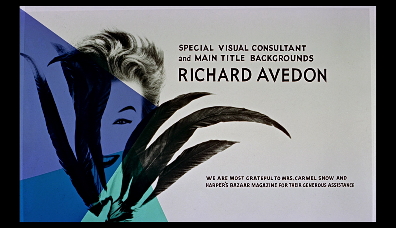
It all starts with a gorgeous opening sequence designed by legendary photographer Richard Avedon, who also served as “Special Visual Consultant”...

Click to read more ...
 Sunday, October 18, 2020 at 10:00AM