Oscar History
Film Bitch History
Welcome

The Film Experience™ was created by Nathaniel R. All material herein is written by our team. (This site is not for profit but for an expression of love for cinema & adjacent artforms.)

Follow TFE on Substackd

Powered by Squarespace
Keep TFE Strong

We're looking for 500... no 390 SubscribersIf you read us daily, please be one.  

I ♥ The Film Experience

THANKS IN ADVANCE

What'cha Looking For?
Subscribe

Entries in movie posters (253)

Wednesday
Aug102011

Posterized: Weekend, Drive, Like Crazy, I Don't Know She Does It

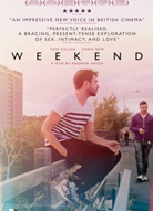
How 'on message' are the crop of posters that have been harvested recently to announce the fall movie slate? Let's take a look starting with this lovely hazy poster for Weekend (2011). I'll ask you first what you feel about it at first glance before I talk about the movie after the image. The poster was shot by Quinford + Scout a couple who have been documenting their own relationship in photographs.

Andrew Haigh's romantic drama follows a quiet gay man (Tom Cullen) through a one night stand with a political artist (Chris New) and watches as it stretches into the next morning and beyond in ways that surprise both of them. The film has won festival awards at SXSW, OutFest and Nashville (yours truly was on that last jury) and when it finally arrives in the fall it will undoubtedly draw comparisons to Before Sunrise for the surface reasons that it's a small, talky, mostly two character romance (though otherwise its quite different). The deeper similarity is that it's actually very, very good. I think this poster is exceptional at conveying that you're in for a mood piece, something memorable to hang on to like a faded treasured photograph and as such I think it's great. But I've actually seen the film. Maybe it won't say much if you haven't?

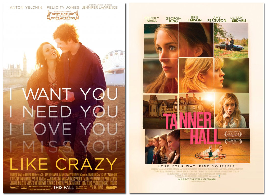
Two other new posters are also going for moods that verge on nostalgia if more traditionally warm and golden: another romantic drama Like Crazy which will attempt to convert its Sundance buzz to Oscar hype on October 28th,  and a film I'd never heard of called Tanner Hall about a girl's boarding school starring Rooney Mara. Ah, that's why. It was filmed in 2009 but it's coming September 9th now that Mara's star is in the process of ascending.

Am I forcing trends now?

Sarah Jessica Parker, Brad Pitt and Ryan Gosling after the jump

Click to read more ...

Tuesday
Aug092011

Sick Character Posters for "Contagion"


Paolo here, apologizing for the pun. If you'd like, you can leave yours in the comments section unless you think it's too early for that kind of fun.

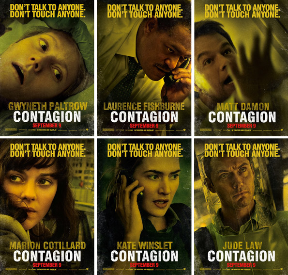
Because the 'city' poster for Steven Soderbergh's new film Contagion wasn't enough, MovieLine via Yahoo! has uploaded the new character posters for the film, bearing the images of its six major stars. This is much better than the boring poster designs wherein actors faces are separated by boxes. The sepia tone also works well here. But the unfortunate thing about character posters in this case is that it doesn't convey the interpersonal and global reach that should come with films about diseases or plagues. But if we're looking to see how these characters are connected to another, the trailer (previously discussed) conveys that pretty well.

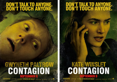
Gwyneth Paltrow (the first victim) has the strongest poster. The other ones aren't as exciting, with Beth's husband (Matt Damon) being scared, Marion Cotillard running or driving away from something within the big city, Jude Law in plastic and Laurence Fishburne and our girl crush Kate Winslet's character Dr. Erin Mears frantically talking on their phones. Someone tweeted to me that only Larry and Kate look good in these posters, the rest of the actors rightfully mangled within the drama of their scenes. [For larger images, click the actor names.]  

A little factoid that you all probably know is that Gwynnie and Kate to the left were both in the running for the Oscar winning role of Viola de Lesseps in Shakespeare in Love. Both women frequently show up in Miramax/Weinstein films but they're lending their talents to the Warner Brothers this year.

Why aren't we getting Bryan Cranston and John Hawkes character posters? You want to see them right?

Friday
Jul292011

The Ides of March Poster Splits the Difference

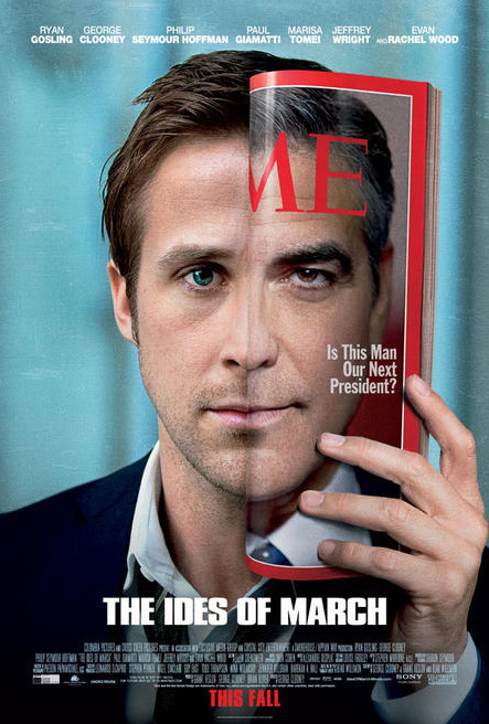
Robert here (Distant Relatives) with a look at The Ides of March poster which gives us half of Ryan and half of George staring out at us. What do we call this being? The Cloosling?

Still, it give us a look at both featured actors, throws in some political intrigue with the "is this man our next president?" line and is sure to get a few double takes hanging in a movie theater lobby. In that sense it's a well done poster. Then again, it's just about the only way to get George Clooney and Ryan Gosling together on a poster and make it somewhat aesthetically offputting.

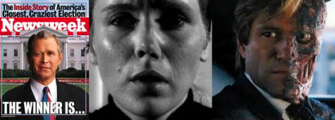
It also reminds me of three similar face-mashing images in politics and movies.

  • A famous magazine cover from 2000 that it might be intentionally referencing much in the way that Clooney's campaign posters reference Obama's.
  • Ingmar Bergman's unsettling imagery from his film suggesting two people combining to build a bigger Persona.
  • Or perhaps it's a more blunt assessment of a quality often found in politicians or operatives.

Newsweek 2000, Liv Ullman & Bibi Andersson in Persona, Two-Face

Tuesday
Jul192011

Posters Should Be Seen and Not Heard. And Other Grievances.

So Annoying! Let it be known: I'm not going to post the leaked teaser to The Amazing Spider-Man. I didn't even watch it despite it popping up everywhere. I don't understand the internet fascination with getting everything before you're supposed to even if that means crappy quality fuzziness. Why spoil a first view with a bad copy of something? 

So Annoying Part 2!
That Hunger Games motion poster that everyone is posting. I opted to just screengrab it for y'all because it's so NOISY. At one point with all the windows I open up when I'm working it sounded like my whole apartment was on fire and it's already hot enough up in here.

In addition to setting your computer aflame virtually -- thus denying you marshmallows to make up for it --  the poster counts down the days until the movie opens which will unfortunately NOT put an end to the constant publicity and internet jabbering about it since it's going to be a quadrilogy or something and if Harry Potter taught us anything it's that the world likes television more than the movies and would like the movies to just become television series with new seasons lasting 2 1/2 hours opening for as many years in a row as possible. The minute that Season One of The Hunger Games opens people will just start speculating about Season Two of the Hunger Games

Y'all know I love the movie posters and anything Hollywood can do to liven them up is appreciated. Only please do so very quietly. Like you're in the library. Or a church. The Holy Church of The Cinema.

The movies aren't silent anymore but posters still should be. 

Sunday
Jul102011

"The Link! The Link!"

My New Plaid Pants Meet Brienne, who'll be very important on Game of Thrones. Eventually.
Critical Condition asks what it will take to get Ewan McGregor an Oscar nomination? We've been asking this for years. He ought to have at least two by now (Moulin Rouge! and Trainspotting)
Tom Shone makes a sound ExPat confession about Harry Potter and the Deathly Hallows Part 2. Heh.
Frankly My Dear remembers Richard Linklater's Slacker for its 20th.
Pajiba Peter Dinklage (Game of Thrones) will play Hervé "the plane! the plane!" Villechaize in the biographical My Dinner With Hervé. Like Pajiba I don't see a resemblance at all but Dinklage is a great actor so we wish him all the best in the role.
Sunset Gun recommends Over the Edge with Matt Dillon as a great time capsule and timeless rebellion teen film. I haven't seen this one but I'm now intrigued.
PopMatters I'm not going anywhere near Zookeeper but I'm finding the reviews somewhat interesting in a staring through thick glass kind of way. This one wonders which voice actor has the worst job in the film. That's a good question! 

Several blogs have been noting the revision of the Straw Dogs poster -- the original version is to your right where Alexander Skarsgård is mysteriously inside of or ramming into James Marsden's eye (ouch!) rather than reflected in his glasses. Poster design is so half-assed these days, right? It looks much better (to your left) now all black and white and reflected. BUT while they were revising shouldn't they have come up with their own design rather than just recreating the original poster from the 70s Dustin Hoffman film?

Poster design is just so frustrating in Hollywood. The internet reminds us every single day --  and usually several times an hour -- that there are abundant graphic artists out there with the talent to make this another golden age of movie poster design and it just never quite happens. Hollywood, which runs on images, doesn't trust the visual literacy of its clients.

Maybe they shouldn't. I mean I'm sure you've all heard someone look at the rare illustrated movie poster and say "is that a cartoon?" but it's still sad-making.