
The Furniture: Demolition and Preservation in The Molly Maguires
Daniel Walber's series on Production Design. Click on the images to see them in magnified detail.
 Every now and then, while poring over lists of Oscar nominees from years past, you stumble across a movie you’ve never heard of. Not even once. In 1970, the Best Art Direction category included two big war movies (Patton and Tora! Tora! Tora!), another hit Best Picture nominee (Airport) and Scrooge, the musical adaptation of A Christmas Carol starring Albert Finney. Then there’s The Molly Maguires, the only one not nominated in any other category.
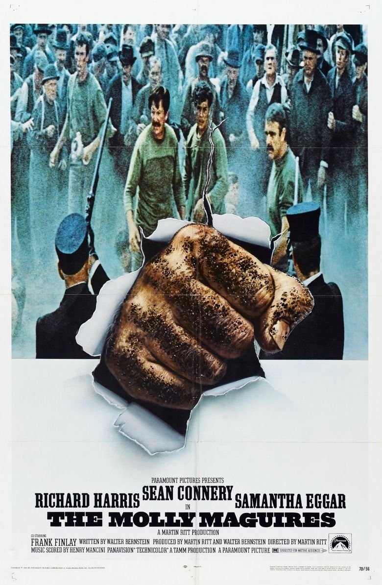
So what’s The Molly Maguires? Well, for one thing, it wasn’t a hit. But that may have been more a result of the film’s dour subject matter than its quality. It stars Richard Harris as a real life undercover Pinkerton Detective, tasked with infiltrating a group of Irish industrial terrorists in 1870s Pennsylvania coal country. Though just a few men, the Molly Maguires have been creating tremendous chaos, blowing up mines and eliminating abusive company supervisors.

These are the early days of organized labor in America, when robber barons hired armies of ersatz police to brutally repress strikes and intimidate low wage workers. Sean Connery’s “Black Jack” Kehoe and his co-conspirators are immigrant miners who have been pushed too far...
 Daniel Walber