Oscar History
Film Bitch History
Welcome

The Film Experience™ was created by Nathaniel R. All material herein is written by our team. (This site is not for profit but for an expression of love for cinema & adjacent artforms.)

Follow TFE on Substackd

Powered by Squarespace
COMMENTS


Keep TFE Strong

We're looking for 500... no 390 SubscribersIf you read us daily, please be one.  

I ♥ The Film Experience

THANKS IN ADVANCE

What'cha Looking For?
Subscribe

Entries in Production Design (228)

Monday
Dec112017

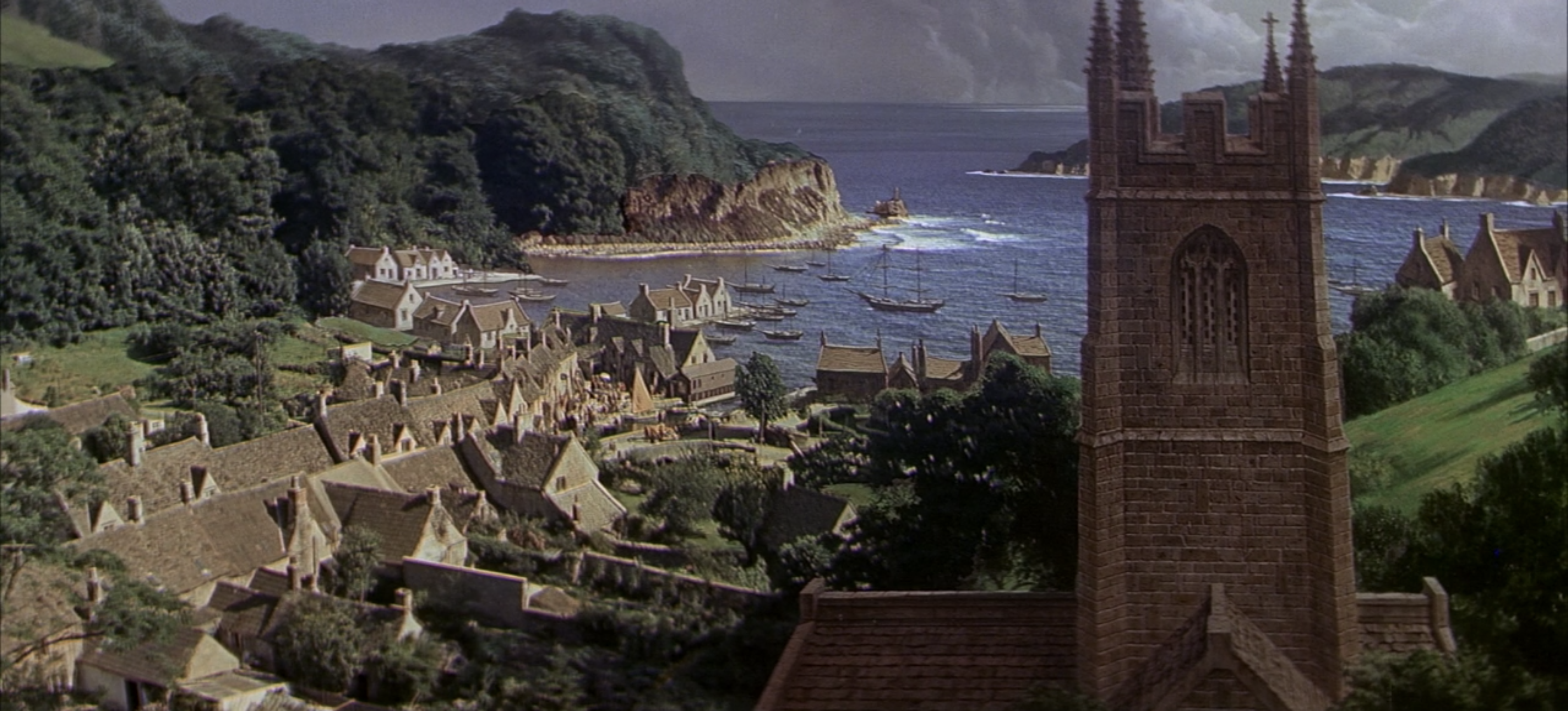
The Furniture: Matte Paintings at the End of an Era

"The Furniture," by Daniel Walber, is our weekly series on Production Design. You can click on the images to see them in magnified detail.

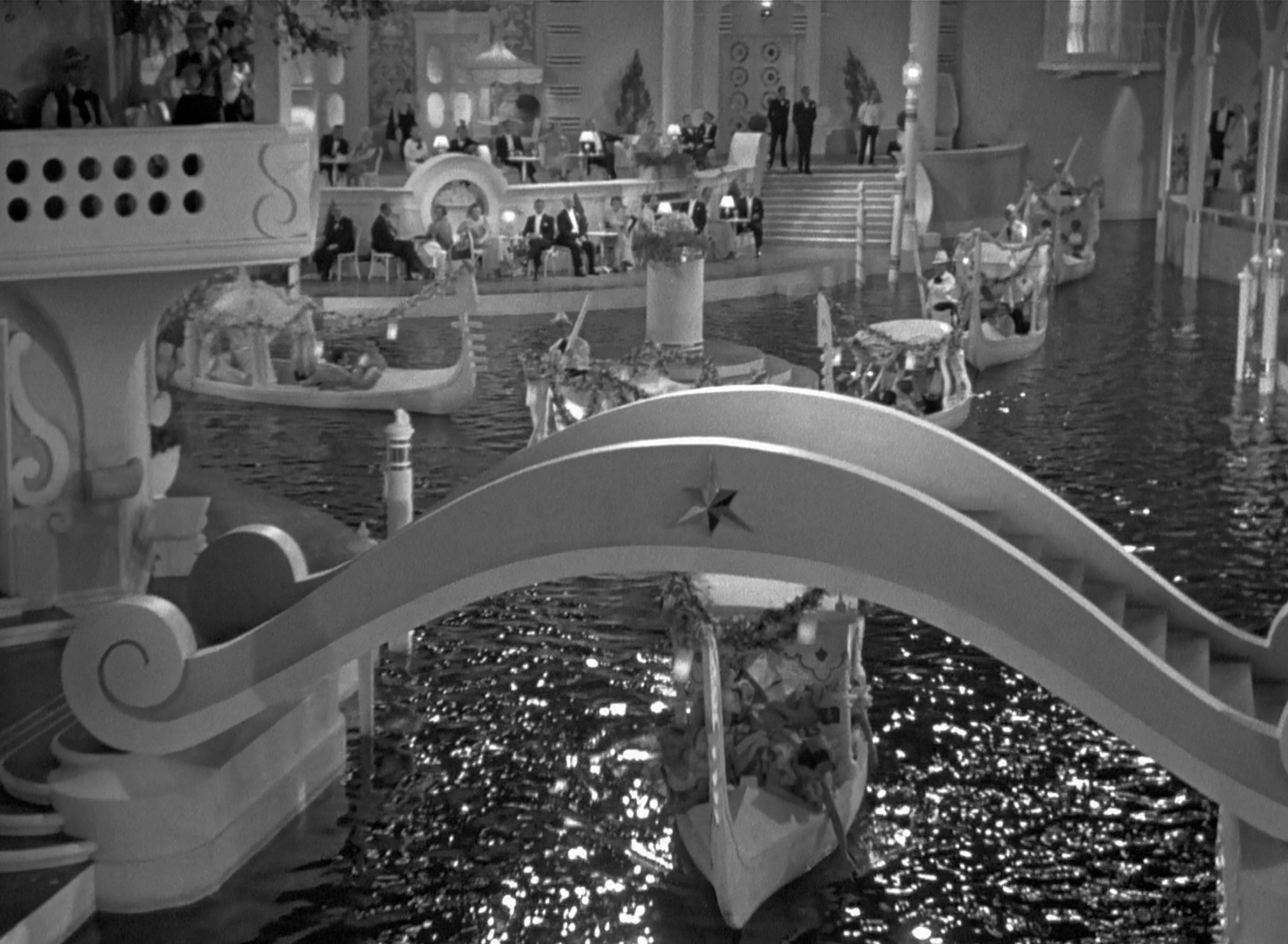
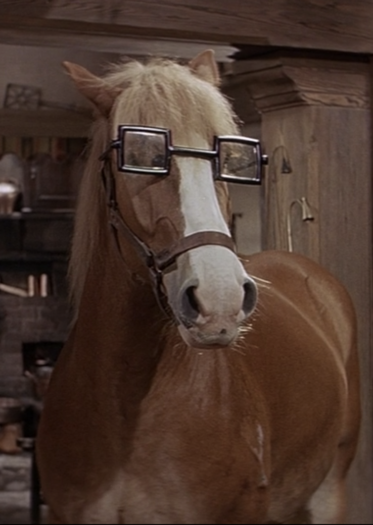
Over the course of the past year, I’ve done an informal retrospective series on the Best Production Design nominees of 1967. It isn’t an especially “New Hollywood” lineup, despite being the year of “Pictures at a Revolution.” Four of the nominees are lush period pieces, three of them lengthy musicals. They often feel like extravagantly-designed chaos, whirlwinds of sets and props that spin out of control. This is true of both the hilarious brawls of The Taming of the Shrew and the dated, stereotype-laden adventures of Thoroughly Modern Millie. Camelot, the winner, manages to split the difference between Old Hollywood excess and New Hollywood sexuality.

The final two films, both Best Picture nominees, are a bit less of a thrill. Guess Who’s Coming to Dinner and Doctor Dolittle are, respectively, the most realistic and most fantastical of the five nominees. However, despite their differences, they both underline the inadequate end-point of old-school studio design.

Click to read more ...

Monday
Nov272017

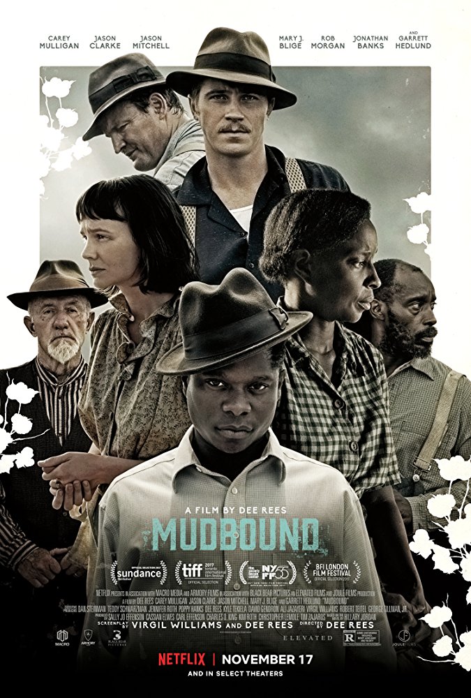
The Furniture: Building a Way out of Mudbound

"The Furniture," by Daniel Walber, is our weekly series on Production Design. You can click on the images to see them in magnified detail. 

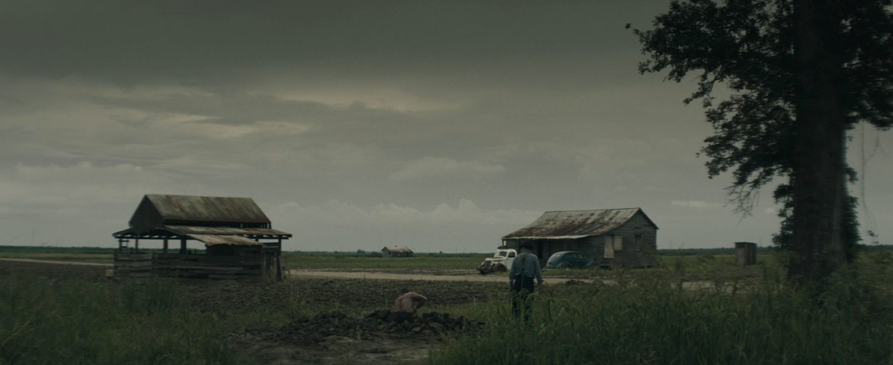
“I dreamed in brown,” remembers Laura McAllan (Carey Mulligan), surveying the near-monochrome dirt of a Mississippi farm. This small pocket of land is owned by her husband, Henry (Jason Clarke), but one doesn’t get much of a sense that she’d call it home. He appears not to like it either, but is motivated by a sour sense of duty. Perhaps this is why his agricultural efforts fail, barely introducing any green into this expanse of brown.

Even more obvious, when it comes to metaphors, is the way Mudbound begins. Dee Rees opens her earthbound epic on Henry in the dirt, digging a grave. The deceased is his Pappy (Jonathan Banks), an acrimonious Klan member who has done his utmost to pass his ideology down to his sons. It’s largely worked on Henry. Jamie (Garrett Hedlund) resists, but still winds up digging in the mud.


At the bottom of this new ditch, Henry finds a skull. It’s a “slave’s grave,” he declares; he can tell by the bullet-hole. It’s a hint at an old story, one that Rees knows she needn’t bother put into words...

Click to read more ...

Monday
Nov202017

The Furniture: Atomic Blonde's Neon Nihilism

"The Furniture," by Daniel Walber, is our weekly series on Production Design. You can click on the images to see them in magnified detail. 

The design of Atomic Blonde is, well, cool. The colors are cool and the vibe is cool, in a very straightforward way. It’s nothing like the characters, who constantly double-cross each other. The twists and turns of this last-minute Cold War spy movie keep coming until its final moments. Everyone is suspicious, even if it’s not obvious.

Yet the landscape upon which Lorraine (Charlize Theron) and Percival (James McAvoy), the Brits, Americans, French, Russians, West Germans and East Germans play is remarkably uniform. Perhaps this is because the film, directed by David Leitch (John Wick) and written by Kurt Johnstad (300) sees them all as working the same game. It’s a bit like the moral landscape of Sicario, the nihilism of film noir without any of its grand mysteries. The question is no longer “What is evil?” but rather “Why are all these people who signed up for a violent and amoral profession behaving so violently and without morals?”

Click to read more ...

Monday
Nov132017

The Furniture: 25 Years Trapped in Castle Dracula

"The Furniture," by Daniel Walber, is our weekly series on Production Design. You can click on the images to see them in magnified detail. 

Bram Stoker’s Dracula turns 25 years old today. It is, appropriately, not dead. Not that a film can die, exactly, but this one has held onto its toothy vigor with particular success. Even the ridiculous way Keanu pronounces “Bewdapest” still charms. Eiko Ishioka’s Oscar-winning costumes seem simultaneously ancient and way ahead of their time. The same goes for the Oscar-winning makeup, which transforms Gary Oldman across centuries with bewildering commitment. The visual effects, which went unnominated, remain thrilling, a dizzying phantasmagoria of cinematic shadow-puppetry.

But I’m here to rave about the only nominated category that the film didn’t win. Production designer Thomas E. Sanders and art director Garrett Lewis were nominated, but they lost to Howards End. Hard to argue with that, of course. Yet their work on Bram Stoker’s Dracula is just as worthy in its complexity, engaging with the material deep within the extravagance and color. Sanders and Lewis demonstrate a creativity well beyond the Gothic castles and thick cobwebs of the genre’s lesser films, shining a newly bloodstained light on this most famous of vampire stories.

The home of the monstrous count itself is a perfect example. Dracula lives in a decaying tower, but a fraction of his former seat of power. It hovers over a cliff in a remote corner of Transylvania, all but removed from the eyes of the living. It cascades upwards, every story more mangled than the last...

Click to read more ...

Monday
Oct302017

The Furniture: Framing the Unseen in Personal Shopper

"The Furniture," by Daniel Walber, is our weekly series on Production Design. You can click on the images to see them in magnified detail.

Personal Shopper is a film about ghosts, and where to find them. Maureen (Kristen Stewart) is a bereaved twin, waiting in Paris for a sign from her recently deceased brother, Lewis. But it doesn’t come easy, not in the least bit due to some unpleasant cross-currents in her professional life. She acquires clothes and accessories for Kyra (Nora von Waldstatten), a celebrity who has an irritating penchant for holding onto things she was meant to return. Maureen jets across the city and rockets under the English Channel on her behalf, toting jewelry boxes and garment bags.

All of which is to say that the material of this film is transient and fleeting, the inevitable intangibility of the personal shopper’s trade. And, of course, it is also about the translucent transience of ghosts, especially ghosts that struggle to make contact. Olivier Assayas has created a layered projection of Maureen’s psychology that refuses her the simple clarity of the mirror. Instead, she seeks her brother and herself in all of the wrong places, only slowly understanding the nature of presence.

Click to read more ...