Oscar History
Film Bitch History
Welcome

The Film Experience™ was created by Nathaniel R. All material herein is written by our team. (This site is not for profit but for an expression of love for cinema & adjacent artforms.)

Follow TFE on Substackd

Powered by Squarespace
COMMENTS


Keep TFE Strong

We're looking for 500... no 390 SubscribersIf you read us daily, please be one.  

I ♥ The Film Experience

THANKS IN ADVANCE

What'cha Looking For?
Subscribe

Entries in Production Design (228)

Monday
Oct232017

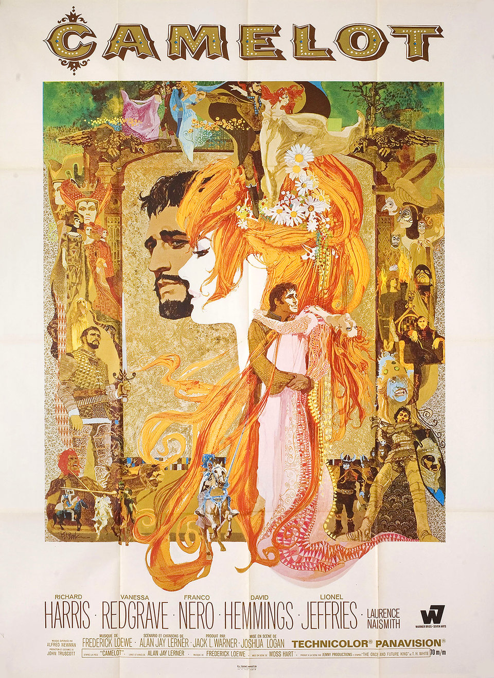
The Furniture: Camelot, a Silly and Furry Place

"The Furniture," by Daniel Walber, is our weekly series on Production Design. You can click on the images to see them in magnified detail.

Back in August, I wrote about two dramatically different ways of portraying Arthurian Legend on screen. To recap: the bright silliness of Knights of the Round Table (1953) looks like psychedelic compared to the bland grit of King Arthur (2004) and the gruff, imperial fantasia of King Arthur: Legend of the Sword (2017). But even these at least share a mild interest in engaging with English historical design. Camelot (1967), on the other hand, is a flighty fantasy of utter nonsense.

Of course, this is why it’s such a delight to watch. It’s a furry, oversexed epic that sends its glamorous cast out into magical forests to sing Lerner and Loewe songs at the top of their extravagantly-adorned lungs. The film won Oscars for production designer John Truscott, art director Edward Carrere and set decorator John Brown, with Truscott taking home a second statuette for the costumes. Lavishly made and lavishly awarded, it’s a classic of committed inspiration.

Click to read more ...

Monday
Oct162017

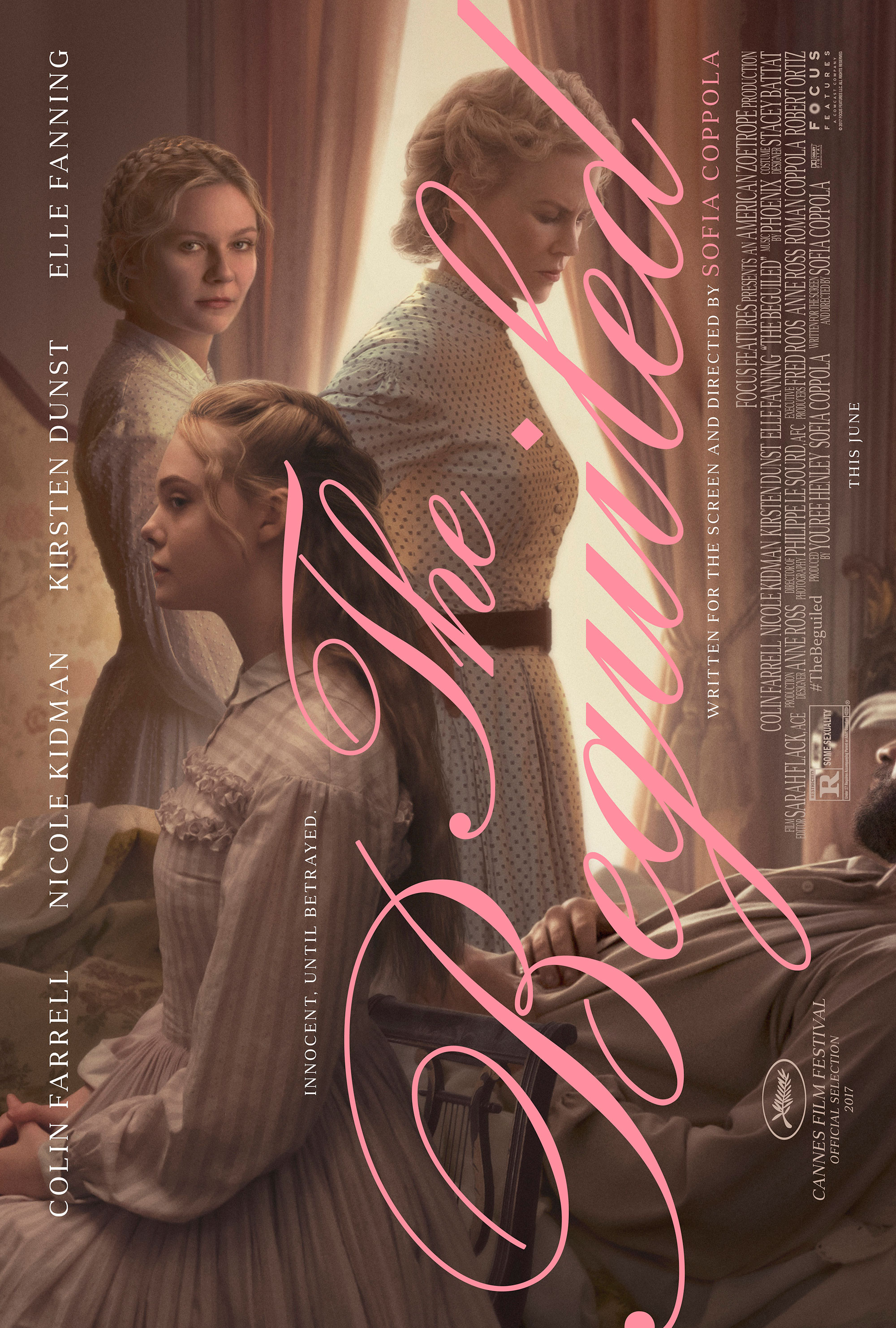
The Furniture: A Plaster Haze in The Beguiled

"The Furniture," by Daniel Walber, is our weekly series on Production Design. You can click on the images to see them in magnified detail.

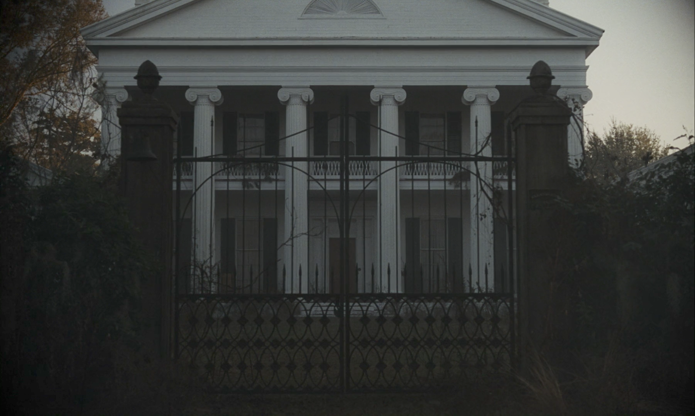
Sofia Coppola’s The Beguiled is no sprawling epic of the Civil War. The Farnsworth Seminary for Girls, where Miss Martha Farnsworth (Nicole Kidman) presides, is no Tara. There are no ballgowns or battlefields. There is only a big lonely house, the seat of a plantation that has decayed into an isolated finishing school for an especially isolated handful of girls.

Corporal John McBurney (Colin Farrell) is thrust into this setting, his leg wounded and his uniform bloodied. The resulting tension simmers for days, weeks even, before exploding in nocturnal chaos and violence. All the while the house stands silent, forcing these emotions up and down the stairs and into small, dimly-lit corners. There is a forever haze about this place, though never quite hot enough to break into a sweat.

This tightly-knotted mood owes a great deal to production designer Anne Ross, a frequent collaborator of Coppola’s, as well as art director Jennifer Dehghan and set decorator Amy Beth Silver...

Click to read more ...

Monday
Oct092017

The Furniture: The Gas Lighting of Gaslighting in Gaslight

"The Furniture," by Daniel Walber, is our weekly series on Production Design. You can click on the images to see them in magnified detail.

This week I’d like to talk about gas lighting. That’s in addition to gaslighting, which is obviously related. Basically, I’d like to talk about the way that Gaslight (1944) uses gas lighting to distill the concept of gaslighting. It was so effective that “gaslighting” stuck, and has remained a popularly understood concept nearly 75 years after the film debuted.

Of course, these days the term has been almost completely divorced from memory of the original play or its various adaptations. The 1944 version is mostly remembered for winning Ingrid Bergman her first Oscar, and deservedly so. Her performance is astonishing, newly powerful with each successive viewing.

However, the film did win a second Oscar. Not for director George Cukor, who wasn’t even nominated. Nor for cinematographer Joseph Ruttenberg, who lost to Joseph LaShelle’s work on Laura...

Click to read more ...

Monday
Oct022017

The Furniture: Slack Bay's Giddy Grotesqueries

"The Furniture," by Daniel Walber, is our weekly series on Production Design. You can click on the images to see them in magnified detail.

“Look! Mussel-gatherers!” Isabelle Van Peteghem (Valeria Bruni-Tedeschi) shrieks. “How picturesque!”

Her deranged tone of voice, along with the confused faces of the mussel-gatherers, let you know that you’re watching a Bruno Dumont film. Slack Bay is a comedy of manners and hats, kidnapping and cannibalism. Set on the coast of Northern France in 1910, it’s a period piece with no shortage of surprises.

Initially, the film seems to be making a fairly straightforward point about tourism and class. André (Fabrice Luchini) and Isabelle Van Peteghem are nightmarishly enthusiastic. Aude (Juliette Binoche), André’s sister, is even worse. They all find everything terribly amusing, including the budding friendship between Aude’s daughter, Billie (Raph), and a local kid named Ma Loute (Brandon Lavieville). The interior of their home mimics the interiors of their heads, packed with dusty, fancy nonsense.

Click to read more ...

Monday
Sep252017

The Furniture: Death by Excess in What a Way to Go!

"The Furniture," by Daniel Walber, is our weekly series on Production Design. You can click on the images to see them in magnified detail.

Any excuse to talk about What a Way to Go! is a good excuse. But the centennial of Ted Haworth is an especially excellent excuse. He was nominated for six Oscars, starting with Marty in 1955. He won for 1957’s Sayonara. Highlights from the rest of his career include Some Like It Hot, The Beguiled, and Pat Garrett & Billy the Kid.

But none of those movies could hold a candle to the astonishing level of creativity on display in What a Way to Go! The epic 1964 comedy of love and loss stars Shirley MacLaine as Louisa May Foster, a many-time widow and heiress.  Each husband, with one particularly tragic exception, begins the marriage as a near-pauper who wants nothing but love. But their passion inevitably leads them on a wild pursuit of wealth, which tends to end in a coffin. It should be noted, of course, that Louisa herself has little interest in cash.

There are far too many brilliant design elements to fit into a single column...

Click to read more ...