Oscar History
Film Bitch History
Welcome

The Film Experience™ was created by Nathaniel R. All material herein is written by our team. (This site is not for profit but for an expression of love for cinema & adjacent artforms.)

Follow TFE on Substackd

Powered by Squarespace
COMMENTS
Keep TFE Strong

We're looking for 500... no 390 SubscribersIf you read us daily, please be one.  

I ♥ The Film Experience

THANKS IN ADVANCE

What'cha Looking For?
Subscribe

Entries in Production Design (228)

Monday
Sep262016

The Furniture: Bored at the Border in "Hold Back the Dawn"

"The Furniture" our weekly series on Production Design. Here's Daniel Walber

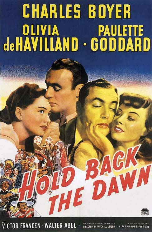
Today marks the 75th anniversary of the release of Hold Back the Dawn, the film for which Olivia de Havilland received her first Best Actress nomination. Now, I know what you’re thinking. Didn’t we have a whole month of de Havilland back in June, in the lead-up to her 100th birthday? Yes, we did. But I am here to inform you that celebrating this two-time Oscar-winner isn’t an occasional thing. It's an essential part of life.

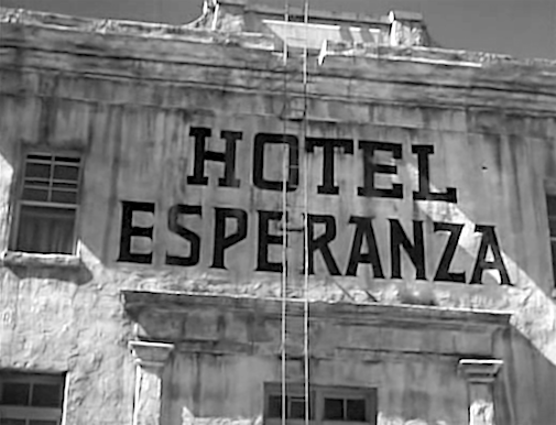
Besides, the film is great. It’s a smart, cynical melodrama about a Romanian playboy named Georges Iscovescu (Charles Boyer), biding his time in a small Mexican town while he waits to be granted entry into the United States. It’ll be years, thanks to the National Origins Formula. Charles Brackett and Billy Wilder’s script was adapted from a story by Ketti Frings, but also took inspiration from Wilder’s own experiences as a refugee stranded by the quota system.

Fed up, Georges looks for other ways to get across. On the 4th of July he meets Emmy Brown (de Havilland), a thoroughly wholesome schoolteacher. She’s taken her students on a cross-border field trip... 

Click to read more ...

Monday
Sep192016

The Furniture: The Malevolent Secret Code of The Conjuring 2

"The Furniture" our weekly series on Production Design. Here's Daniel Walber

There are many ways to scare an audience. Music, special effects and editing are combined to surprise the audience with loud, unexpected images of malevolent demons or slashers or whatever. But what about production design? Can you be terrified by a stationary armchair?

The Conjuring 2 holds all the answers. James Wan is an excellent horror craftsman, a director who uses every trick in the book, including the sets and props. Production designer Julie Berghoff and art directors A. Todd Holland and Andrew Rothschild run amok, with the same ferocity as the film's music and editing.

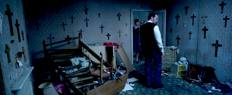
Their first order of business is to exploit some of the genre’s stand-by images. There are a lot of crosses, in this case an entire roomful.

They stand at attention, ready to demonically invert themselves at a moment’s notice. There are smaller crucifixes sprinkled throughout the film, as well as the occasional window lit to resemble a cross... 

Click to read more ...

Monday
Sep122016

The Furniture: Love & Friendship's Country Charm

"The Furniture" is our weekly series on Production Design. Here's Daniel Walber...

Chirp.Lady Susan Vernon (Kate Beckinsale) finds the countryside boring. She’d much rather be in London, safe from her daughter and her other dull relations. Yet she’s broke and bound by obligation to spend time at a large country estate. This is the central problem of Whit Stillman’s Love & Friendship, a delightful adaptation of Jane Austen’s Lady Susan.

The estate in question is Churchill, the home of her brother-in-law Charles Vernon and his wife, Catherine Vernon (nee DeCourcy). Granted, as the amusingly dim-witted Sir James Martin points out, there appears to be neither church nor hill on the property. Instead there is only period-appropriate finery and some very subtle efforts to manipulate audience loyalty.

Production designer Anna Rackard and art directors Louise Mathews and Bryan Tormey go about this with great care. 

Lady Susan is a selfish, scheming character whose relatives almost certainly deserve more of our sympathy. Yet she’s the protagonist, and also quite funny. We can’t be allowed to tire of her too quickly. And so the production design team emphasizes a point on which many of us can agree with Lady Susan: The countryside is the worst...

Click to read more ...

Wednesday
Sep072016

5 Wishes for the Production Design Emmys

By Daniel Walber.

The Emmys can be, for lack of a better word, boring. Television is in a "Golden Age," or so everyone says, but its Academy has a tendency to reward the same shows every year. This phenomenon doesn’t only happen at the top of the ticket, either. Game of Thrones has been as much of a mainstay in tech categories as Modern Family was in Best Comedy Series.

And so, rather than fully handicapping the five production design races, I’d like to share some more modest hopes for this year’s winners. Here are some selections from my favorite work in the category, regardless of the odds.

Outstanding Production Design for a Narrative Contemporary or Fantasy Program (One Hour or More)

This is the Game of Thrones category, and it’ll probably stay that way. That said, I find the work on Penny Dreadful a lot more intriguing, at least for this season. 

 In just one episode, “Evil Spirits in Heavenly Places,” there are at least three sets worthy of recognition. The work so lavish that one wonders if it was canceled because it was too expensive...

Click to read more ...

Monday
Sep052016

The Furniture: Comedy by Design in Come Blow Your Horn

1963 is our "Year of the Month" for September. So we'll be celebrating its films randomly throughout the month. Here's Daniel Walber...

Once upon a time, there were two production design categories at the Oscars. From 1945 through 1956, and again from 1959 through 1966, color films and black and white films competed separately. The Academy nominated ten films every year after 1950, creating a whole lot more room for variety.

This especially benefited comedy, a genre that has since fallen out of favor with Oscar. And while Come Blow Your Horn might not be the funniest of the 1960s, it is certainly one of the most deserving nominees of the era. Adapted by Norman Lear from a Neil Simon play, this Frank Sinatra vehicle stages most of its antics in one of cinema’s most luxurious apartments, the work of art directors Roland Anderson (Breakfast at Tiffany’s) and Hal Pereira (Vertigo) and set decorators Sam Comer (Rear Window) and James W. Payne (The Sting).

Sinatra plays Alan Baker, a salesman for his family’s plastic fruit business. His boss and father, Harry (Lee J. Cobb), is perpetually enraged by his son’s libertine Manhattan lifestyle. Harry and his wife Sophie, played by Yiddish theater legend Molly Picon, live a quiet life in Yonkers with their much younger son, Buddy (Tony Bill). But when Buddy runs away from home to live large with Alan, all hell breaks loose.

Alan's apartment in question is a spotless and opulent apotheosis of mid-century design. The open living room makes the place seem enormous...

Click to read more ...