Oscar History
Film Bitch History
Welcome

The Film Experience™ was created by Nathaniel R. All material herein is written by our team. (This site is not for profit but for an expression of love for cinema & adjacent artforms.)

Follow TFE on Substackd

Powered by Squarespace
Keep TFE Strong

We're looking for 500... no 390 SubscribersIf you read us daily, please be one.  

I ♥ The Film Experience

THANKS IN ADVANCE

What'cha Looking For?
Subscribe

Entries in Production Design (228)

Monday
Aug292016

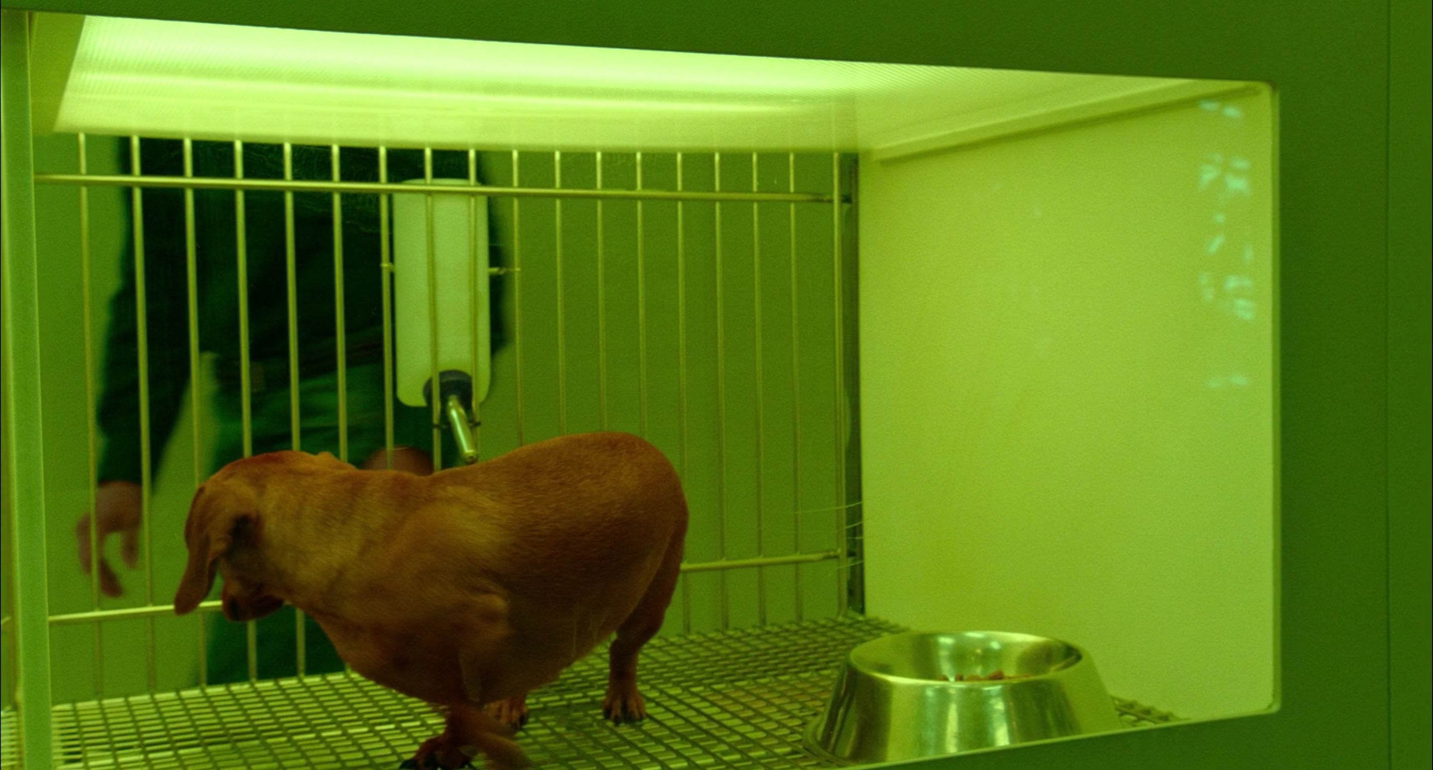
The Furniture: Wiener-Dog's Sickly Green Cages

by Daniel Walber

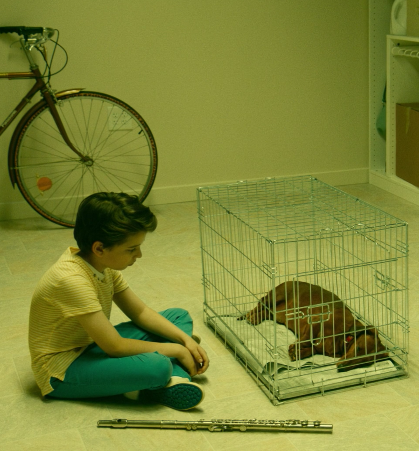
Wiener-Dog is a deceptive movie. It is technically a sequel to Todd Solondz’s cult classic Welcome to the Dollhouse, but only for about a quarter of its running time. It’s actually an anthology, built around the often tragic life of an adorable, stoic dachshund. Each stop is totally separate from the last, each new character a slightly different riff on solitude and bitterness.

Yet even this structural diversity is deceptive. For while the film contains a variety of stories and locations, it is essentially one long expansion of a single set. The opening credits play over an anonymous animal shelter, where Wiener-Dog patiently waits to be adopted. One side has bars, the other a clear panel. The bright light highlights the sickly green walls, like the antiseptic glow of a dystopian hospital.

Wiener-Dog makes it out, but the cage lingers...

Click to read more ...

Monday
Aug222016

The Furniture: Fantastic Voyage's Absurd Anatomy

"The Furniture" is our weekly series on Production Design. Here's Daniel Walber... 
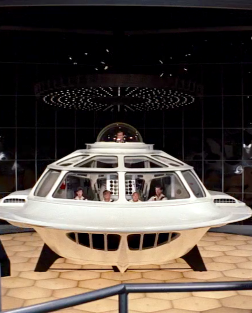
This week marks the 50th anniversary of Richard Fleischer’s Fantastic Voyage, as absurd and beautiful a film as Hollywood has ever made. It’s also a testament to what live action science fiction used to be like, before digital technology gave directors the tools to make every fantasy look realistic.

Inspired by the arms races of the Cold War, it chronicles a submarine trip into the tumorous brain of a brilliant scientist. The mission is to eliminate his cancer with a tiny laser, save his life, and preserve his miniaturization knowledge for the USA. It’s utterly ridiculous. Isaac Asimov, alarmed by the script’s plot holes, demanded the right to fix all of its problems for his novelization.

Of course, that might classify him as a bit of a fuddy-duddy. Trips into the body wouldn’t be nearly as much fun if they were realistic. If anything, they’d probably gross out the audience. 

Pixar understood this, creating an entirely new organ system for Inside Out. Fleischer’s team for Fantastic Voyage also prioritized the striking over the reasonable.

Much of this success is, of course, due to the production design...

Click to read more ...

Monday
Aug152016

The Furniture: The Lobster's Phony Flowers

"The Furniture" is our weekly series on Production Design. Here's Daniel Walber... 

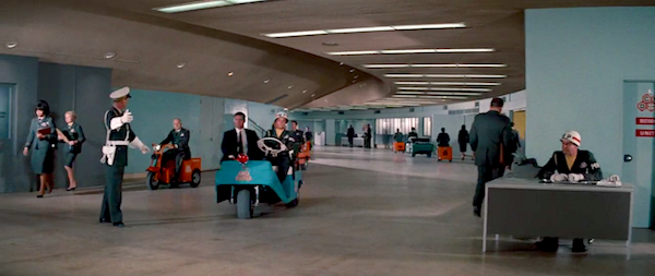
In a 2014 interview, production designer Jacqueline Abrahams described her job as “creating an environment that is credible but sometimes incredible...always aiming to be authentic in spite of being made up.” As this was two years ago, she may not have had her work on The Lobster in mind. Yet the sentiment couldn’t be a more perfect fit for the weird universe of Yorgos Lanthimos.

The dystopia of The Lobster, after all, is not particularly flashy. It’s a world just like our own, only a little grayer. If every frame held immediate physical evidence of a dramatically different future, the carefully calibrated mood would collapse. Instead, the dystopia emerges subtly, through little gestures of performance and design.

Abrahams, a BAFTA-winner for her work on BBC’s Wallander, is an integral part of this achievement. Her presence is felt from the first shot, in which she makes her acting debut as the woman who shoots a donkey on the side of the road. Her design contributions are even more memorable.

The hotel for singles is a triumph of carefully planned ennui. If you look closely, you can pick up the tone from the very first scene within this last resort...

Click to read more ...

Saturday
Aug132016

Review: Meryl Streep as "Florence Foster Jenkins"

This review was originally published in Nathaniel's column at Towleroad

It takes a gifted singer to sing this horribly. Every other note is wrong. No phrasing goes unmangled by shortness of breath. No lovely moment meant to soar cannot be shattered by a flat ear-piercing decibel. The central conceit of Stephen Frears new comedy Florence Foster Jenkins is that Florence, a considerably wealthy patron of the arts played by Meryl Streep, lives for music but is ghastly at it. The inside joke, given the casting, is that we all know La Streep can sing with the best of them. She followed the "is there nothing she can't do?" revelation of Ironweed's tragic showstopper "He's Me Pal" (1987, Oscar-Nominated) with transcendent country crooner feeling in Postcards From the Edge (1990, Oscar-Nominated), and just kept on singing whenever a movie gave her the opportunity all the way up through last year's Ricki and the Flash which was practically a concert film there were so many scenes of Streep at the mic, rocking out.

Florence Foster Jenkins doesn't rock out. Florence is not that kind of girl and Florence, also, is not the kind of movie...

Click to read more ...

Monday
Aug082016

The Furniture: The Paper Opulence of Amadeus

1984 is our "Year of the Month" for August. So we'll be celebrating its films randomly throughout the month. Here's Daniel Walber...

Simon Callow as PapagenoAmadeus is not a biopic, it’s a myth. Milos Forman’s adaptation of Peter Shaffer’s play is an utterly absurd portrayal of a long ago, unknown relationship. Antonio Salieri may not have had any negative feelings toward Wolfgang Amadeus Mozart, but that hardly matters. The legend, a story of deep faith that twists into jealousy, is a whole lot more interesting than the truth.

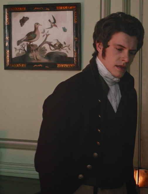
The film’s production design mimics the delicious falseness of its narrative. The Vienna of Emperor Joseph II is opulent, to be sure, but it is a strange opulence. Rather than focus on the grandeur of the palaces, Forman keeps much of the drama in drawing rooms. Production designer Patrizia von Brandenstein and art director Karel Cerny keep away from too much gold and silver, instead creating bizarre tableaux of a miniature society.

Even more striking are the recreations of the opera theater. For these, Forman called on Joseph Svoboda, the founder of Prague’s Laterna Magika and an internationally renowned opera director. He produced scenes from four of Mozart’s operas for the film, as well as one by Salieri.

They are all both extravagant and shabby, in line with both the presumed wealth of Emperor Joseph II’s court and the theatrical limitations of the 18th century...

Click to read more ...