


Curio: Alternative Oscar Art
Alexa here. It's that time of year, where artists and designers take a crack at creating alternative posters for the Oscar nominated films. As they do every year the BAFTAs commissioned posters for their nominated films; the Academy is at least featuring movie Valentines from illustrator Nan Lawson on its site but I wish they'd feature some alternative nominee posters too (grumble grumble). To fill the void, here are some favorite designs I've spied floating around...

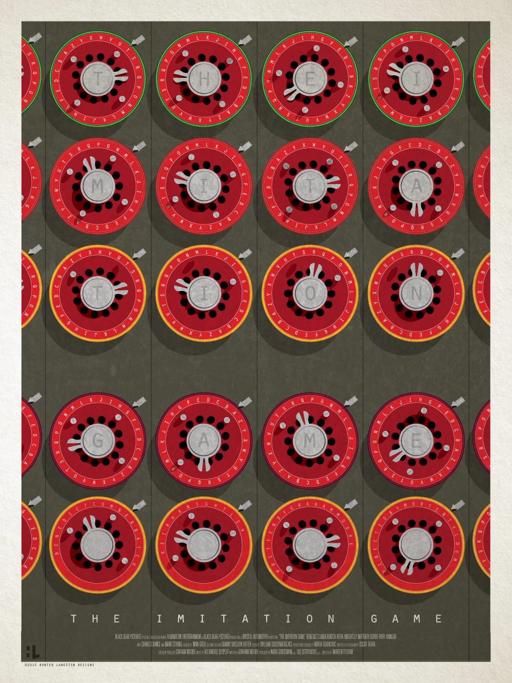
 another by Hunter Langston
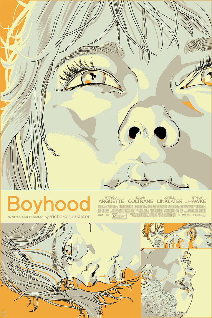
 by Peter Strain
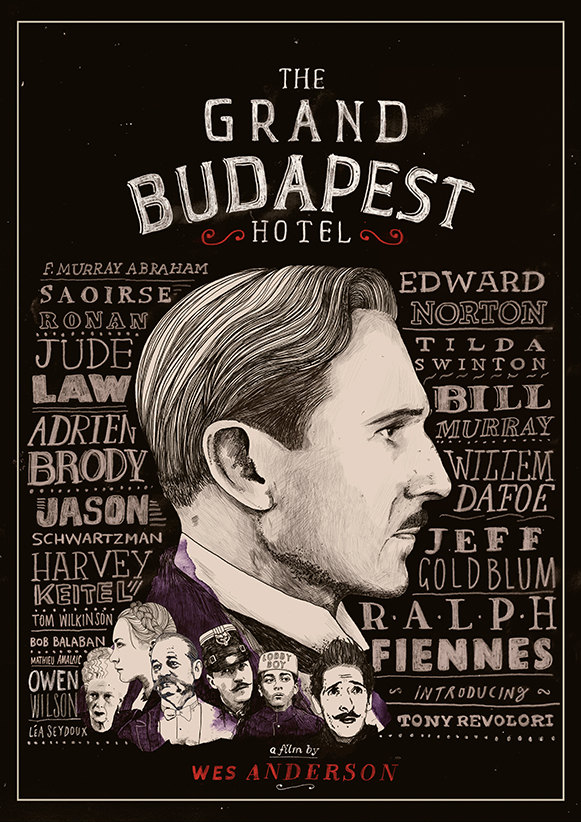
 Poster for Mondo by Tomer Hanuka
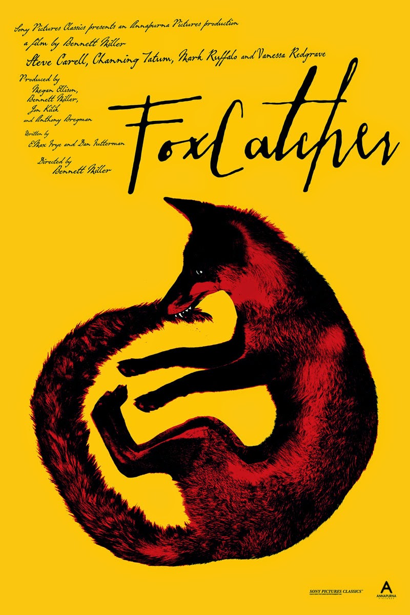
And due to a depressing lack of Selma designs (that film just can't catch a break), I've filled the void with my favorite design for Foxcatcher. Happy Oscars everyone!
 Poster for Mondo by Jay Shaw
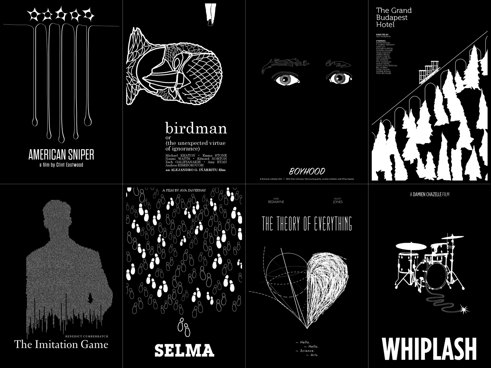 All the nominees by ll-og
 Alexa
Alexa
Reader Comments (13)
That Boyhood poster is *creepy*!
That Grand Budapest poster makes me think of Bullets Over Broadway so much!
The poster for GBH reminds me that Ralph Fiennes was completely ROBBED of a nomination.
Boyhood looks a lot like Scarlett in Under the Skin.
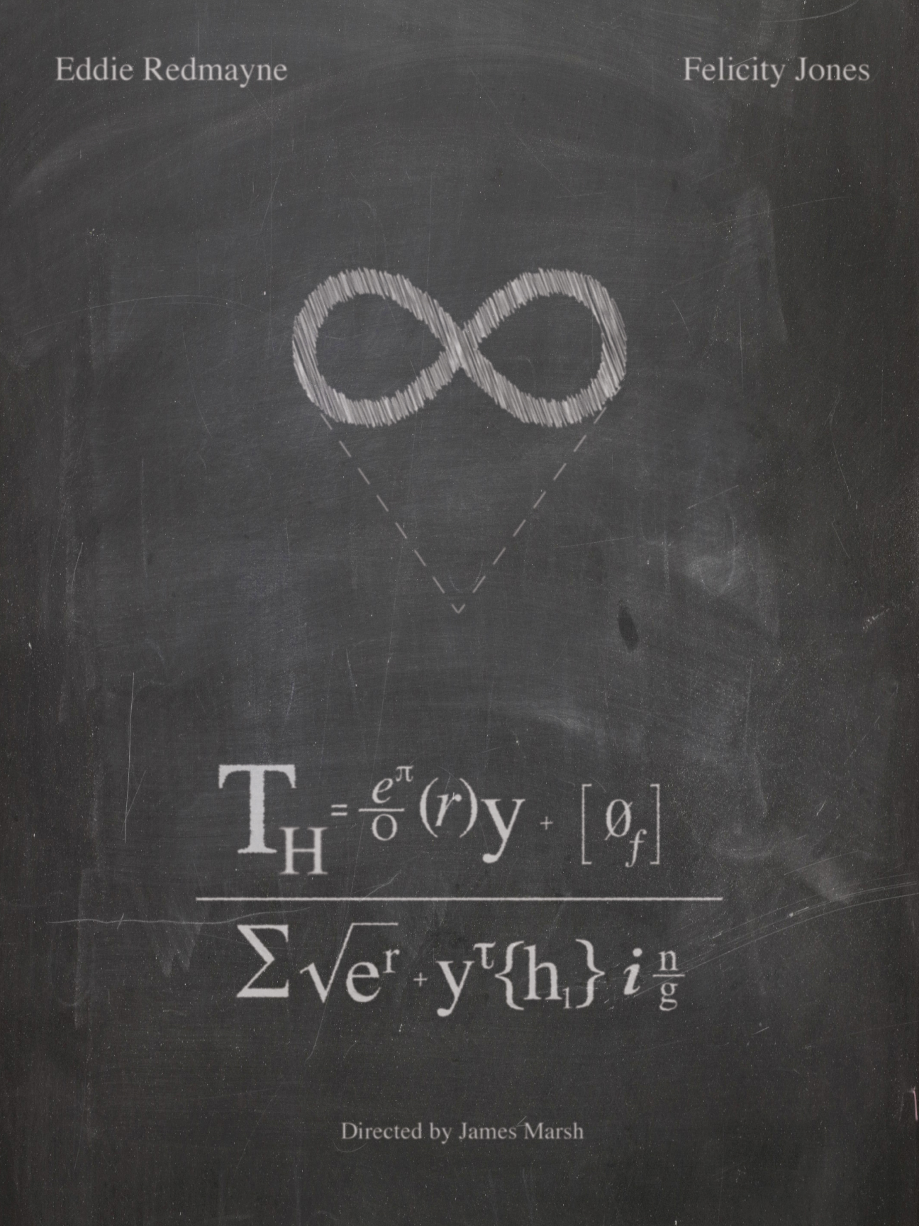
That poster for Theory of Everything is outstanding.
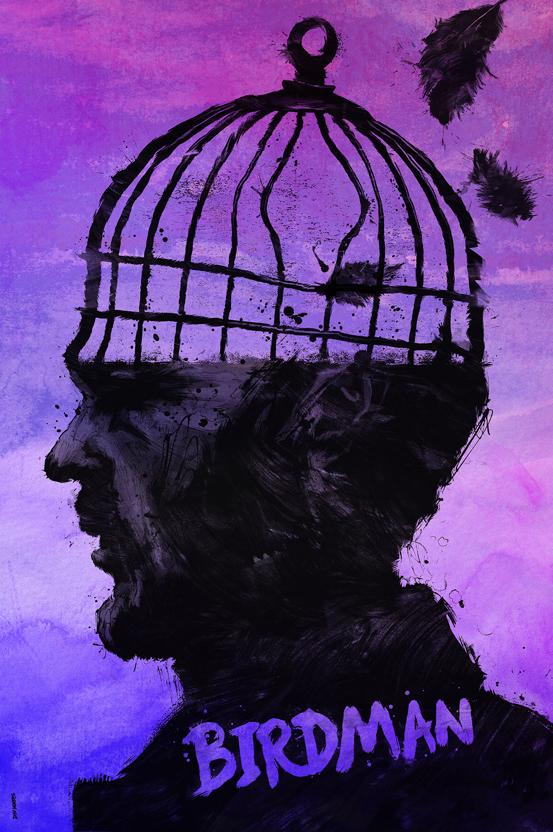
I'd put that Birdman poster with the empty cage head directly on my wall. So great! o_Ob
Sonja: I'd put it up...if I thought it reflected the movie's ultimate point on Riggan. But it doesn't. The movie thinks his mind (the cage) is chaotic and always moving, not empty. There should be a bunch of angry or psychotic looking birds there drawn to approximate motion, because make no mistake: Though it doesn't agree with Riggan's self perception, it also doesn't REALLY agree with Lindsay Duncan's dressing down. Mostly because I'm pretty sure it views that dressing down as a hallucination.
I never thought that "The Imitation Game" would be my favorite in anything!
The Theory of Everything's font is fantastic, but the rest are only so-so except for that Whiplash poster which is terrible. Way to make the title literal in a way no one needed to see and if you can't properly draw a grown man then find a way around that.
Poster by Poster:
Whiplash: Um...Too obvious for something that's seen the movie. I'd get rid of the whip and have Fletcher screaming with just his head and arms visible with the rest of him buried in an ice bucket while Neiman is reaching inside. Okay.
Imitation Game: Uses that interesting visual detail better than what I've seen of the movie's ads. Good.
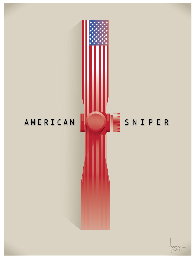
American Sniper: I get the idea, but very questionable angle/perspective, making it look more like a drawing of a patriotic fire hydrant. Bad.
The Theory of Everything: Best poster of the set, such that I wish the movie actually reflected the intellectual and aesthetic tone of THIS poster more than the actual iconic poster. Great.
Birdman: I've said my piece. Visually very interesting, but doesn't reflect the movie's true perspective on Riggan. Passable.
The Grand Budapest Hotel: There is no Grand Budapest, there is only Gustave H. Good.
Boyhood: Like the "A Scanner Darkly" undertones of the imagery here. Good.
Foxcatcher: Fox biting his tail. Interesting metaphor for Carell's performance that is pretty OTT for a movie with Bennett Miller's aesthetic. Good.
@Volvagia
Well, I admit I haven't seen Birdman yet, so thanks for the clarifiying insight. I still love the style though.
The whip in the Whiplash art is too literal, but otherwise I like it.
I like the Whiplash poster because it's as subtle as the movie itself and by that I mean not at all. Kinda makes you think if Inariitu had directed Whiplash for absurdist comedy elements like Birdman. :/
I like the Whiplash poster but only as an inside joke. Even if it is an improvement over the official one.
The Theory poster is far better than the one they actually use to promote the film. Inspired.
The rest are mediocre to blah. Sniper has the germ of a good idea, but needs something more recognizable in the center..