Oscar History
Film Bitch History
Welcome

The Film Experience™ was created by Nathaniel R. All material herein is written by our team. (This site is not for profit but for an expression of love for cinema & adjacent artforms.)

Follow TFE on Substackd

Powered by Squarespace
Keep TFE Strong

We're looking for 500... no 390 SubscribersIf you read us daily, please be one.  

I ♥ The Film Experience

THANKS IN ADVANCE

What'cha Looking For?
Subscribe

Entries in Art Direction (70)

Thursday
Jun302011

The Academy's Production Design Database

Did any of you catch that AMPAS has opened up a Production Design Database? It's just got two sample searches right now "Science Fiction" and "Wedding Clothes" and many of the items you still have to make appointments to actually see but what they do have up gives you a taste of their rich history. (It's better to search more generally -- like say by picking a year -- than to search for a specific film). Since I didn't do as much as I intended for the June Wedding theme here at the blog, I thought I'd share a couple of their illustrations for one last walk down an aisle (and to give you a taste of the type of stuff they have.)
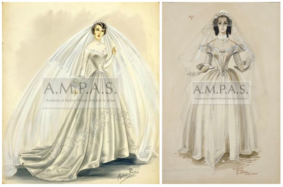

The wedding search is more Costume Design than Production Design but those two departments are usually tight. In the picture above you see illustrations of stars Elizabeth Taylor and Olivia De Havilland in gowns they wore in real life (Liz's wedding to Nicky Hilton) or on film (that's Olivia's gown from My Cousin Rachel).

My favorite thing in their "wedding" database was this: a storyboard of one of the most hilarious scenes from Funny Girl (1968)
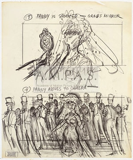
Fanny: I ask my looking glass what-is-it? That makes me so exquisite?
Chorus: The answer to your query, is come back dearie.
His love makes me beautiful, so beautiful. You are so beautiful
Fanny: I am so byootiful.

That scene makes me LOL every time, how about you? Barbra Streisand totes deserved that Best Actress statue. 

Thursday
Apr282011

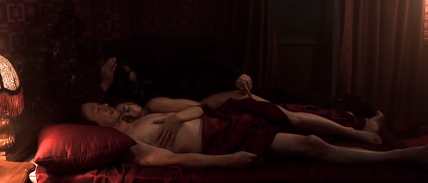
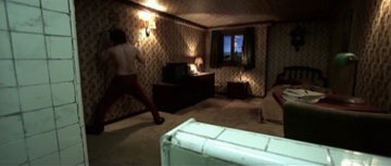
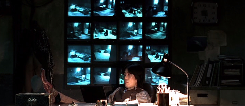
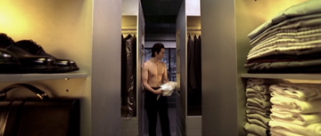
Unsung Heroes: The Production Design of 'Oldboy'

Michael C from Serious Film here. I watched the subject of today's column again recently for maybe the third or fourth time and it simply demanded to be written about.


What is it about Chan-wook Park’s Oldboy (2003) that makes it so difficult to shake? 

My thoughts kept returning to it for months after seeing it for the first time. I certainly admired it for its wickedly clever plotting and for the actors' fearlessly committed performances. Yet there are lots of movies I admire that don’t haunt me like this one did.

I think I find my way back to Oldboy so often because it feels unlike every other movie out there. The world of Oldboy is presented as a version of reality (nothing takes place without an explanation, however over-the-top) but the more I think about it, the more I realize Oldboy is as much a fantasy as Star Wars or Blade Runner. Only instead of being set in the future or on a different planet, it takes the world we know and edges it into the stuff of nightmares. A place where seemingly normal locations such as a schoolyard or a computer lab are warped and foreboding in ways we can’t always put our finger on. 

And that is just what the production designer Seong-hie Ryu does with the mundane locations. The script of Oldboy calls for a few places where there is no precedent to draw from. The task of designing a room where a man has to remain imprisoned for fifteen years for no apparent reason is a daunting one. That horrible little room is the emotional core of the whole story. It needs to make an impression. Ryu responds with a masterpiece of art direction, and he does it with some cheap motel furniture, a sickening color scheme and above all else that hellish “inspirational” painting on the wall.

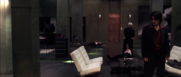
But as unforgettable as that room is, the real tour de force of production design is the apartment of the story’s villain Woo-jin Lee. Just as challenging as crafting a cell worthy of the film's riveting opening sequence, is the creation of a stage suitable for the operatic tragedy of Oldboy’s climax.

So many of the details are so perfectly chosen, from that pond with its narrow walkways to the ominous littering about of antique cameras. My favorite detail is that amazing giant cube that opens up into a closet. It serves the multiple purposes of 1) being objectively fascinating to look at. I’ve never seen one of those before. 2) Fleshing out the character of Woo-jin Lee. Be wary of any man with a closet like that. 3) Being just the right amount of creepy and portentous, and 4) Being a great subtle symbol for the hidden secrets that are about to reveal themselves. Not bad for one piece of furniture.

That apartment, along with that prison where Oh Dae-su spends those fifteen years, goes on a list alongside Jack Rabbit Slim’s in Pulp Fiction and the lair of the Pale Man in Pan’s Labyrinth. Movie locations I will not soon forget


Wednesday
Apr062011

"these strange links happen all the time"

Alt Film Guide reports on a fascinating-sounding Art Direction seminar coming to Hollywood later this month. It's $40 for the whole series / $30 for students. I'd sign up if I were in LA. Several Oscar nominees are speaking.
Towleroad Remember when Julianne Moore was supposed to play Hilary Clinton?
Time is taking your votes for their upcoming Time 100 list. The list is narrowed down to 200 now. Naturally some movie people are on the finalist list including but by no means limited to Lee Unkrich of Pixar fame, Angie & Brad, and to my delight, The Bening.
Gold Derby Speaking of Annette Bening. She's getting another honor this time from Women in Film in June. But weirdness. They've named Katie Holmes "the face of the future" Um... This isn't 1999.

Go Fug Yourself imagines a conversation between Nicole Kidman & Keith Urban. Comes with the requisite poll of course. Do you like this look?
Twitch, noticing all the underage killers in movies, does the only sane thing one can do: LIST.
Stale Popcorn posts his self proclaimed crowning moment: a top ten Renée Zellweger facial expressions in her Case 39 movie. Oh Zeéeeee you expressive loon.
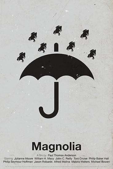
Viktor Hertz Pictogram Movie Posters? Have I ever shared these before? I can't keep track. They're so fun. The best ones are for the horror movies like Psycho and Rosemary's Baby and Magnolia. Well, Magnolia is not technically a horror movie but I like that poster too. Horror of the soul perhaps?

I didn’t love him when we met and I did so many bad things to him that he doesn’t know. Things that I want to confess to him, but now I do. I love him…. This isn’t any fucking medication talking! This isn’t. I don’t know, I don’t know. Can you give me nothing? You have power of attorney! Can you go, can you go in the final fucking moments and change the will? I don’t want any money. I couldn’t live with myself with this thing that I’ve done. I’ve done so many bad things...

Thursday
Mar172011

Unsung Heroes: The Props of "This is Spinal Tap"

Michael C here from Serious Film this week to throw a little love to the technical support who help make it possible for the geniuses in front of the camera to change comedy forever.

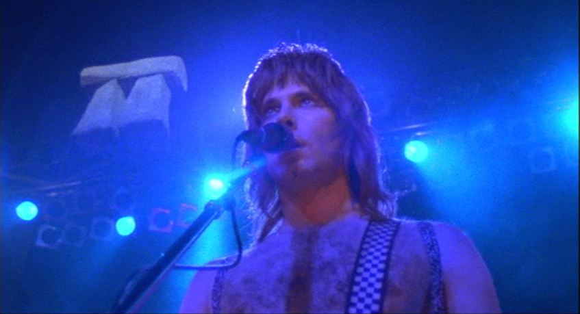
I do not for one think the problem was that the band was down. I think the problem may have been that there was a Stonehenge monument on the stage in danger of being crushed by a dwarf. That tended to understate the hugeness of the object. -  David St. Hubbins


One of the things that makers of Hollywood spoofs and satires seem to have forgotten is that it is important to first establish the reality of the story, and then, and only then, does one proceed to twist and subvert the conventions of the genre. Kubrick knew to let Dr. Strangelove play out with stark simplicity for the whole opening act before the big laughs started to creep in. Mel Brooks knew to let Young Frankenstein feel like a convincing horror classic before the monster started putting on the Ritz. And Rob Reiner clearly knew that his off-the-charts hilarious This is Spinal Tap would be dead in the water if every detail didn’t ring true. The prop work and set decoration placed the bar for mockumentaries at a level that has rarely been approached since.

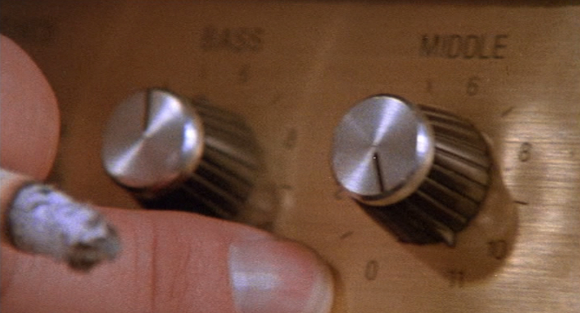
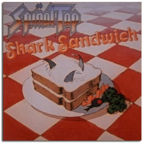
Everything here is exactly the right level of awful. The crappy plastic pod that captures Shearer’s Derek Smalls and the crappy plastic demon skull that looms over the stage are both just good enough to allow the band to delude itself into thinking they're awesome. The legendary amp that goes to eleven displays that extra level with the perfect degree of carelessness, as if a disinterested roadie hastily tacked on the elevens in order to placate the band. One of my favorite bits is the series of briefly glimpsed past albums. The blindingly tacky cover art lets you know in an instant precisely the type of horrible band Spinal Tap is.

And what words can do justice to Stonehenge? That henge has a lot of buildup to fail to live up to and it delivers spectacularly at failing to deliver. Yet one can still spot the faint glimmer of the awesome spectacle the band imagined it would be.

It occurs to me I may be going overboard handing out credit. The wonderfully cheap look of Spinal Tap’s props may simply be a fortuitous result of the movie’s limited budget and shooting schedule. But even if that were that case what difference would it make? Would it be more praise-worthy if Spinal Tap had a prop department the size of Lord of the Rings and the budget of Avatar? The question comes down to how much more perfect could every minor detail of Tap, from the tiny bread on Nigel’s refreshment tray to the cucumber in Derek’s trousers, be? And the answer is none. None more perfect.

Tuesday
Feb222011

This is Too Rich...

And by too rich, I mean frugal.

Thanks to Guy Lodge for alerting us via Twitter. It seems that porn producers UKNakedMen may have repurposed The King's Speech's memorable sets for some man-on-man action. And not the kind involving speech therapy though, come to think of it, Colin Firth was seen gagging on balls in the film. (Sorry!)

Mildly NSFW sample / link after the jump 

Click to read more ...