Oscar History
Film Bitch History
Welcome

The Film Experience™ was created by Nathaniel R. All material herein is written by our team. (This site is not for profit but for an expression of love for cinema & adjacent artforms.)

Follow TFE on Substackd

Powered by Squarespace
What'cha Looking For?
Subscribe

Entries in Cinematography (395)

Wednesday
Oct292014

'Nightcrawler' and L.A. in the Digital Age

Glenn here to offer a rebuttal to my own work.
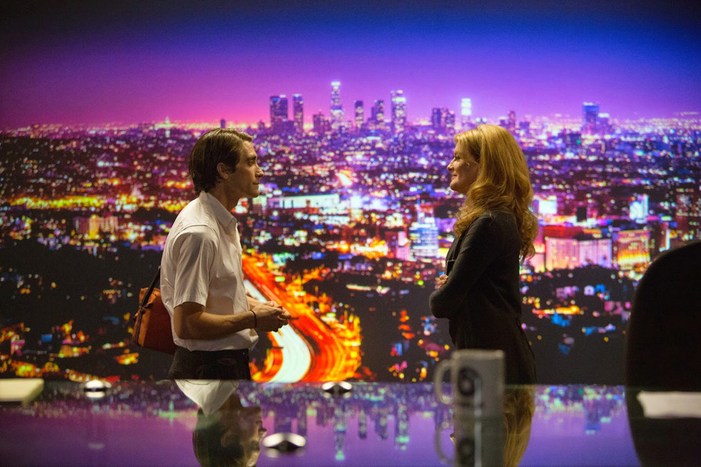
 

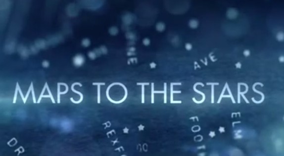
When I reviewed David Cronenberg’s Maps to the Stars at the New York Film Festival, I was highly critical of the film’s look. It’s the ugliest film of 2014 so far and will likely remain a recurring staple of my anti-digital rants for some time to come. Fair is fair, however, and lest I get the reputation of somebody who is strictly against digital, I wanted to sing the praises of Robert Elswit’s work on Nightcrawler. Neither a horror film as befitting its Halloween release date, nor a superhero film like many people have thought due to its title. Yet, in spite it this, the film works as both an unsettling work of urban and moral decay and a portrait of a man who, in his own eyes, is a bit of a hero.

Nightcrawler is a film that has a visual point of view, finding interesting compositions to tell a story that in the grand scheme of things is fairly conventional in its narrative beats and structure. It takes the familiar image of Los Angeles and twists it into a city where at night it becomes a muddy-skied haze. This is a film that is both gorgeous to look at and repugnant to the eye at the same time. The Los Angeles of Nightcrawler seethes and creeps and Elswit’s camera shows just what can be achieved with the medium.

Directed by Dan Gilroy - not to be confused with brothers Tony Gilroy (the film's producer and director of Michael Clayton) or John Gilroy (the editor) - it's certainly very much inspired by the form-pushing work of Dion Beebe (Team Film Experience’s Top Ten Greatest Working Cinematographers) and Paul Cameron on Michael Mann’s Collateral. I don't consider this much of an issue given that film had perhaps my favourite cinematography of the '00s, and what’s the point of groundbreaking work in the industry if it can’t be adapted and played with by future filmmakers? In a way it's the same as how another Jake Gyllenhaal film, End of Watch, appropriated the look made famous by found footage horror and supplanted it onto the streets of gangland L.A.
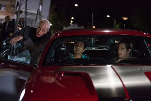
Despite what some people may think, I am very much capable of falling head over heels for digital camerawork. I just appreciate it when filmmakers do something with the format that you otherwise can’t with film. What’s the point of the conversion if not to do something unique that sets it apart? I have no doubt celluloid would have worked amazingly for Gilroy's film, and in fact he did film the daytime sequences on 35mm highlighting how different the two mediums can be. I enjoyed watching that disparity taken advantage of, an aesthetic choice that entirely works for Nightcrawler as it captures Gyllenhaal’s sunken face as he films the aftermath of the city’s violence, pawning his footage to bottom-of-the-barrel TV networks. Leaving my screening and I couldn’t help but think of what Maps to the Stars could’ve been if they’d had anything close to resembling Nightcrawler’s keen sense of craft. That the film is partially about the alarming ease that we can capture the world within which we exist, it makes it incredibly relevant piece of work, too.
Sunday
Oct192014

Review: Birdman, or (The Unexpected Virtue of Ignorance)

An abridged version of this review was originally posted in Nathaniel's weekly column at Towleroad. It is reposted here, with their permission.


A card in the bottom right hand of the star's mirror reads:

"A thing is a thing. Not what is said of that thing." 
-Susan Sontag

Which immediately complicates or maybe simplifies celebrity and art, two major themes (among a handful) of Mexican director Alejandro González Iñárritu's one of a kind new film experience. It's destined for major Oscar nominations and you should see it immediately. The movie has the simple and then complicated title of Birdman, Or (The Unexpected Virtue of Ignorance) as befits its duality perfectly. This quote is never addressed in the film but it's always stubbornly lodged there in that mirror, defying or playfully encouraging conversation about what this movie actually is. And what is film criticism or its more popular cousin, after-movie conversation over dinner drinks or online other than conversation that attempts to interpret and define?

Critics are often treated with petulant hostility in movies about show business, as if the filmmakers have an axe to grind and need to do that with grindstone in hand while their critical avatar/puppet hangs there limply, waiting to be struck with the sharpened blade. Birdman is no exception, immediately insulting its formidable theater critic Tabitha (Lindsay Duncan) as having a face that 'looks like she just licked a homeless man's ass,' before she's even spoken a line. But Tabitha is a slippery mark, portrayed as a voice of integrity in one scene and then a vicious unprofessional monster in another. This calls into question the reality of her scenes altogether

... which is not unusual in Birdman.

Click to read more ...

Saturday
Oct042014

NYFF: Mike Leigh and Dick Pope Begin Oscar Preparations with 'Mr Turner'

It wasn’t just the obvious reasons relating to being a fan of William Turner that made Mike Leigh want to make Mr. Turner. No, what it essentially boiled down to for the British director and his long-gestating passion project was that, essentially, Turner was a clear-cut case of “a Mike Leigh character”. Hearing Leigh describe the famed artist this way actually made me go back and think about the role given that Turner, as portrayed by Timothy Spall in his Cannes-winning performance, hardly comes off as from the same working class terrain of Leigh’s most famous films like Secrets and Lies or Another Year.

I’m still not entirely sure how the statement holds, but the press conference that followed Friday afternoon's screening of Leigh’s lush, gorgeously produced 150-minute biopic did allow for some typically keen insight from the man and his cast and crew who will surely be out there campaigning for the film throughout awards season hoping to crash an already strong roster of British biopics with style and grace typical of a Leigh movie.

Click to read more ...

Monday
Sep292014

NYFF: Seeing Isn't Believing in 'Maps to the Stars'

The New York Film Festival has begun. Here's Glenn taking an alternative look at David Cronenberg's divisive Cannes winner 'Maps to the Stars', now a confirmed 2014 contender.

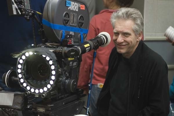
Digital filmmaking has a lot to answer for – much of it good, but a lot of it bad. Its biggest crime, however, may be eradicating David Cronenberg of style. It’s as if the transition of celluloid to digital, which coincided with his swing away from merely a cult name-brand director to one whose films, at least briefly, appeared to be targeting a somewhat more acceptingly mainstream audience (A History of Violence and Eastern Promises certainly), weakened his eye for visual storytelling. Not only is Maps to the Stars a surprisingly ugly film in terms of its garish lighting, messy blocking, and lethargic, bulky transitions, but it’s a distressingly amateur in one in terms of simple camera placement and editing.

Much was made of Matt Zoller Seitz’s plea for film writers to discuss form in more detail. “Form is not just an academic side dish to the main course of content”, he said last year, and while I am not sure what Seitz’s opinion is on Maps to the Stars I can’t imagine he would be too thrilled.

more... 

Click to read more ...

Friday
Sep052014

TIFF: Mommy = Xavier Dolan's Best

Nathaniel's adventures at TIFF. Day 1

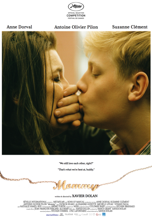
Technically speaking day 2 has just ended and it was an incredible day with consistently great films and memorable offscreen moments. But one day at a time. Day 1's highlight was the Cannes holdover Mommy from Xavier Dolan.

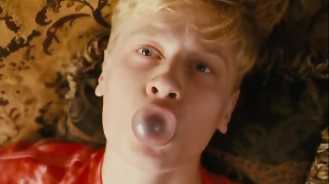
It's attention-grabbing from its first frames with an unusual aspect ratio. Technically speaking it's a 1:1 but if that means nothing to you (I'm not an aspect ratio geek either) know that it's square. Since square is not our beloved and horizontally familiar widescreen, the image feels alarming vertical, more akin to a cel phone shape. This description helps convey the movie's undeniable modernity but it doesn't convey it's lush beauty. (I've heard Mommy knocked as 'the first instagram movie' but, hey, Emmanuel Lubeszki is on instagram so let's not knock it as a Beauty Delivery System.) 

Technical film geekery aside, know this: the screen can barely contain the movie's explosive feelings. Hell, the aspect ratio can't even contain this movie's explosive feelings in one of its own best and most atypically tender jokes. 

MORE...

Click to read more ...