Team FYC: Her for Best Cinematography
 Tuesday, December 17, 2013 at 8:23AM
 Team FYC lets Film Experience contributors highlight their favourite fringe contenders for awards season. Here's Amir Soltani on Spike Jonze's Her.
In recent years, the Academy's cinematography award has been handed out in tandem with the best visual effects one. It has become an inevitability: if there is a best picture nominee that can be described as a "visual spectacle" is present, it will win both awards. This year will be no exception with Gravity, and if I were to put money on it, I'd a hazard a guess that Christopher Nolan's Interstellar will be the beneficiary of AMPAS's infatuation with big, effects driven cinema in this category next year. But Dutch cinematographer Hoyte van Hoytema shouldn't need to wait another year for his first Oscar nomination.

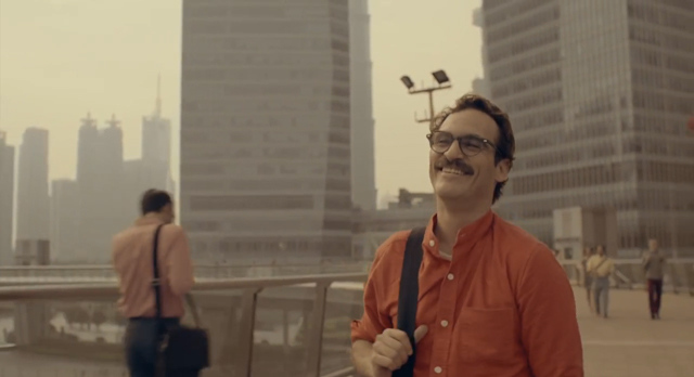
With Spike Jonze's Her, van Hoytema adds yet another impressive entry to a decade-long resume that already boasts an astonishing range of styles. The soft, colorless hues of Let the Right One In and Tinker, Tailor, Soldier, Spy are more easily recognizable as the works of the same DP, but the scrappy, hand-held look of The Fighter is almost a 180 degree turn. Her has shades of van Hoytema's collaborations with Tomas Alfredsson, but is infinitely more vibrant. Perhaps more than any other film this year, the cinematography here needs to be recognized as a collective achievement with the works of the production and costume design teams as it brings their colors and sleek, intimate designs to life, but contains them under extremely soft lighting. It is richly realized but also suitably representative of the cyberspace; think of it as beautifulhandwrittenletters.com incarnate.
In a way, Her's aesthetic is one of contrasts. It is bursting with reds and pinks but it feels melancholy. It is sensitive but equally icy. It seems perfectly appropriate for a film about "artificial" intelligence, creating a landscape that looks ethereally digital, but also oddly palpable. It's apt, because Her is as much about our future as it is about our modern condition and van Hoytema’s work captures that contrast beautifully. Will Academy voters recognize his genius? Does the strong critical response to the film tell us anything about its Oscar hopes? It is certainly possible. Then again, it wouldn’t be the first time a Spike Jonze finds favor with critics and no luck with AMPAS. I’ll keep my fingers crossed.
 Cinematography,
  FYC,
FYC,  Her,
Her,  Hoyte van Hoytema,
  Oscars (13),
  Spike Jonze,
  Team Experience


Reader Comments