Halfway Mark: Cinematography & Production Design
 Friday, July 1, 2016 at 9:00PM
 We've celebrated the male performances and the heroes and villains of the year's first half. But before we get to the actresses -- what? foreplay makes it hotter -- let's revel in the beauty of Cinematography & Production Design. These five choices in each category are what yours truly, Nathaniel, would nominate if the year ended on June 30th. Please share your list of praiseworthy achievements in the comments. Movies are communal and loving them should be, too.
HALFWAY MARK BEAUTY BREAK
CINEMATOGRAPHY & PRODUCTION DESIGN
(January to June theatrical releases only. Disclaimer: I have not yet seen The Mermaid which I hear is an eyeful)
Best Cinematography
If I had a ballot right now (January to June releases only...)

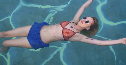
A Bigger Splash, Yorick Le Saux
From gold dust sunshine to postcard istas, from the ambient light of off white seaside architecture to intimate dinners by candlelight, Le Saux is always caressing the already sensual actors with light.

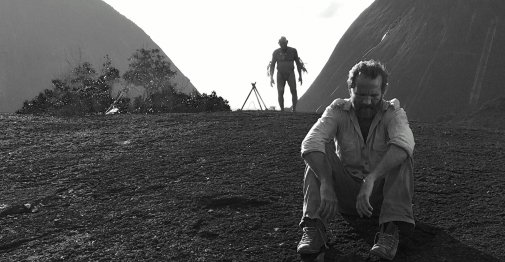
Embrace of the Serpent, David Gallego
In glorious black and white but for hallucinogenic sequences, the sharp contrast photography does wonders to make this already foreign world look ever more forgotten and alien. And there's something about that inky water that makes the whole picture more suspenseful in its rowing languours.
8 more honorees after the jump...
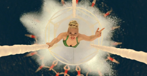
Hail, Caesar!, Roger Deakins
Deakins is one of Hollywood most celebrated DPs (13 Oscar nominations) and he's celebrating Hollywood right back in this gorgeously shot half satiric half loving valentine to Hollywood's paranoia in the studio era.

The Neon Demon, Natasha Braier
Light is a crucial element in this beautiful repellent object of a film. From purple and red filters to kleig light photo shoots to white on white on white barely clothed auditions to dark rooms with only garish makeup and bold blone hair to illuminate the way, Braier serves it up for Refn throughout. I hope Refn and the actresses sent her thank you notes.

The Witch, Jarin Blaschke
Generally speaking The Film Experience has had it -- we've just had it -- with movies that are drained of color. If you are a filmmaker and want to make black and white movies, make them. But color movies that are scared of color do not deserve our eyes. The Witch's harsh but never bright enough light, drains the life from the frame so thoroughly that even the imposing forest looks unnaturally capable of sustaining it The occassional pops of color from blood or animal eyes or The Witch herself are all the more unnerving for visibly forcing their way into view.
Best Production Design
If I had a ballot right now (January to June releases only)...

Hail, Caesar!, Jess Gonchor
Read about this achievement in "The Furniture"

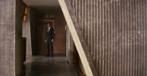
High-Rise, Mark Tildesley
What a treat for Tildesley, to be the star for once. Few movies require their Production Design to be the antagonist but you could argue that this one does. The oppressively tall concrete structure even stresses its vertiginous daring in interior shots. It never feels like its built for humans to feel at home in. but to sort and separate them into their own individual floors and spaces, even providing its own disruptive canted angles. Even when the ceilings and walls are torn apart, the building is winning this battle.

Sunset Song, Andy Harris
Though I wasn't a fan of Terence Davies aching memory drama about a Scottish farm girl's life and loves, I was a fan of the central home life she remembers throughout. The middle of the picture is particularly strong at redressing the formerly oppressive family land nto something that reflects the softness of its new owner. And that barn wedding is a thing of remarkable homely beauty.

Swiss Army Man, Jason Kisvarday
This is a picture you have to see to believe but for about an hour (the middle hour) it actually pulls off its impossibly high bar of a tone. You might describe this tone as earnest wonder, strained through a filter of absurd, crude, and melancholy whimsy. The deserted island and then thick forest that Hank (Paul Dano) and Manny (Daniel Radcliffe) travel through feel appropriately heightened, too empty and too colorful and too art directed which is just right for the picture. It all peaks in the beautifully designed sequence when Hank builds Manny a makeshift bus completely with fake projected scenery.

The Witch, Craig Lathrop
Read about this achievement in "The Furniture"
'What about the other craft categories like costumes, editing, sound, visuals, makeup, etcetera?' you say.
Costumes is coming right up but there's no time for everything right now but in addition to more action for the 14 films just cited in those three categories we'd probably find room for The Jungle Book and The Lobster somewhere and maybe even a nod or two to movies we'd rather not honor (because they're not, you know, good) like Warcraft and Midnight Special. But when it's this early in the year, there is simply not as much greatness to cherry pick from. And besides, even bad films can have strong elements worthy of praise.


Reader Comments (9)
I need to purchase a copy of "Hail Caesar!", it's sumptuous and a pure visual delight.
The plot may not have been the tightest but who cares really...
Whoever is responsible for the cinematography in "The Fits" also deserves a special mention. Everything is so painfully beautiful to look at and I love artists who can bring that out from very mundane settings.
I did not care for Hail Caesar. But it was visually sumptuous.
Just saw A Bigger Splash. Good/interesting movie but the images were too jittery for my taste. A deliberate choice perhaps (making us question our list for the beauty) but not wholly arresting. About to check out The Fits.
Also: can an animated film be eligible for production design? If so I'd put Zootopia in there. Such great detail in the world-building. Huge yeses for The Witch and Hail Caesar on all counts.
"The Mermaid" is an eyeful in so much as you there are some gags you'll never forget, including one involving sushi. However beautiful cinematography it does not really have. What is missing on your list is the gorgeous "Tale Of Tales".
I'm scoring a play in the fall and had to convince the director to watch The Witch. He's totally on board with that kind of visual and audio approach to the period production. So excited. The design on that film is just beautiful.
Hail, Caesar! will follow The Big Lebowski and become a cult classic. Check back with me in 10 years.
I think its cinematography is quite lovely, but the cinematography in A Bigger Splash was extraordinary (particularly in all of the windy scenes).
Loved the cinematography and especially the art direction of The BFG. But if they could overlook Crimson Peak last year, probably nothing so far has a ghost of chance with the Academy's short-term memory. The cinematography of Neon Demon is the film's strongest virtue. But the film overall is so vile I'd be hesitant to reward it for anything. Also loved The Jungle Book's visuals. And too bad Embrace of the Serpent won't be eligible for any Oscars this year. That's the price it pays for getting nominated last year.