NYFF: Norway's Oscar Submission "Thelma"
 Thursday, September 28, 2017 at 1:00PM
 by Jason Adams

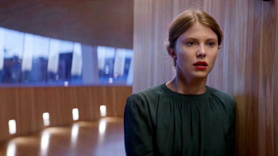
Sometimes a critic can't help but interject him or herself into a review, and Joaquim Trier's Thelma is one of those times for me. Thelma tells the story of a young woman from a cripplingly religious family who goes off to college and starts having epileptic seizures that coincide with an awakening of same-sex longings. Meanwhile I'm the homosexual son of an epileptic and was raised in a speak-in-tongues Pentecostal church. Needless to say I felt Thelma, you guys.
So much that it's hard to divorce myself critically to see the forest for the dead birds dropping down among the trees. Trier gets so many precise details so right that I know from my own specific, particular life experience - the warm waves of excitement and guilt at discovering drink and swear-words when you first leave home; the way an epileptic seizure can be a sudden horrific tearing open of reality itself's seams - that I'm more than willing to go along with anything he does, even when it is sometimes a hint too austere for its own good.
It's hard to say something that features a woman deep-throating a python - but you know, in a sexy way - remains austere, but Trier manages. He is Norwegian, after all. Thelma is an ice pond of a film floating over fiery little volcanic eruptions - like its protagonist (an exquisitely conflicted Eili Harboe) Thelma is Fire & Ice, Passion & Repression, a Freudian phantasmagoria strapped into a cool silk blouse.
 Horror,
  Joachim Trier,
  NYFF,
NYFF,  Norway,
  Oscars (17),
  Scandinavia,
  Thelma,
  foreign films


