Previously in the Year in Review we visited Snow White and the Overrated, Misjudged, Miscast Tomorrow the joyous positivity starts but until then, we purge. Let's rush through this final bout of negativity.
WORST FOREVER-TREND: BAD MOVIE POSTERS

Now I know how the vampires of True Blood feel whey they cry... My eyes! My eyes!
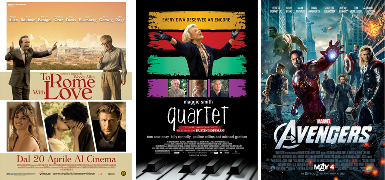
These three posters for To Rome With Love, Quartet and Marvel's The Avengers probably do not represent the absolute worst movie advertisements of the year but they are indicative of three subspecies of Horribilus Posterus: To Rome With Love shoves its cast into multiple little boxes, a common technique that is nearly always hideous on posters but that never stops designers from trying. To make matters worse they've selected color palette so bland that it seems to be advertising air-conditioned nap time, oatmeal breakfast at a theater near you, and A Film By Nancy Meyers all at the same time; Quartet represents the Indecisive Nonsensical brand of bad poster since its retro 80s color blocking suggests period comedy romp (No, sort of, and no) and then it's like oh "every diva deserves an encore" but the movie actually fights against this (I shan't spoil it if you're inclined to suffer through); The Avengers is appropriately colorful but belongs to the most populated subspecies of bad poster, the No One on This Poster Was Ever in The Same Room Together disconnect. Photoshop has become such a crutch for everyone that marketing departments seem to believe that no one values authentic connection in imagery anymore and I absolutely don't believe that's the case. You're paying stars millions of dollars to appear in a movie but you can't require in their contract that they pose together for promotional materials?
Worst Miscellania and 5 Worst Movies of the Year after the jump
Click to read more ...
 Thursday, January 31, 2013 at 4:26PM


