Oscar History
Film Bitch History
Welcome

The Film Experience™ was created by Nathaniel R. All material herein is written by our team. (This site is not for profit but for an expression of love for cinema & adjacent artforms.)

Follow TFE on Substackd

Powered by Squarespace
COMMENTS


Keep TFE Strong

We're looking for 500... no 390 SubscribersIf you read us daily, please be one.  

I ♥ The Film Experience

THANKS IN ADVANCE

What'cha Looking For?
Subscribe

Entries in Production Design (228)

Monday
Mar202017

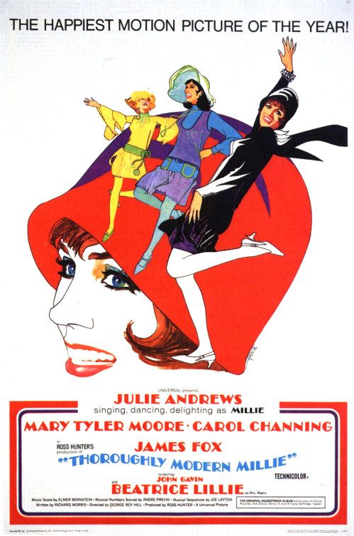
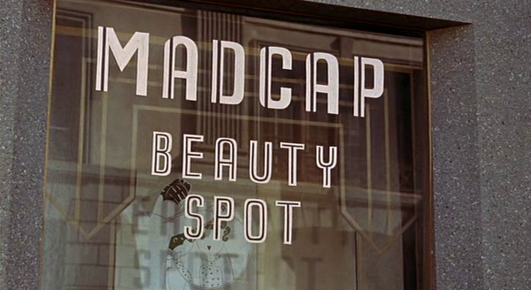
The Furniture: Thoroughly Modern Millie

"The Furniture" is our weekly series on Production Design. Here's Daniel Walber...

Thoroughly Modern Millie opened 50 years ago this week, in the spring between San Francisco’s Human Be-In and the Summer of Love. None of 1967’s Best Picture nominees, immortalized as the birth of the New Hollywood in Mark Harris’s Pictures at a Revolution, had yet opened, but there was already something in the air.

Director George Roy Hill capitalized on this countercultural moment with an extravagant show of concentrated nostalgia. Thoroughly Modern Millie leaps back to the Roaring 20s, America’s last moment of liberated sexuality and conspicuous consumption before the Great Depression. Its flamboyant, frenetic ode to the flappers and their world was a big hit, making more than $34 million and landing 10th at the yearly box office. The film was nominated for seven Oscars including Art Direction-Set Decoration.

Yet its portrayal is not without contradictions...

Click to read more ...

Monday
Mar132017

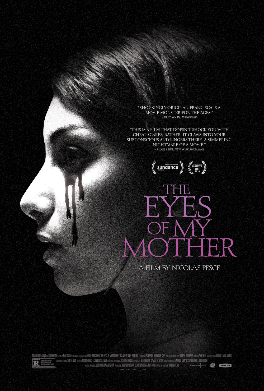
The Furniture: Stark Contrast in "The Eyes of My Mother"

"The Furniture" is our weekly series on Production Design. (Click on the images to see them in their more detailed large glory.) Here's Daniel Walber...

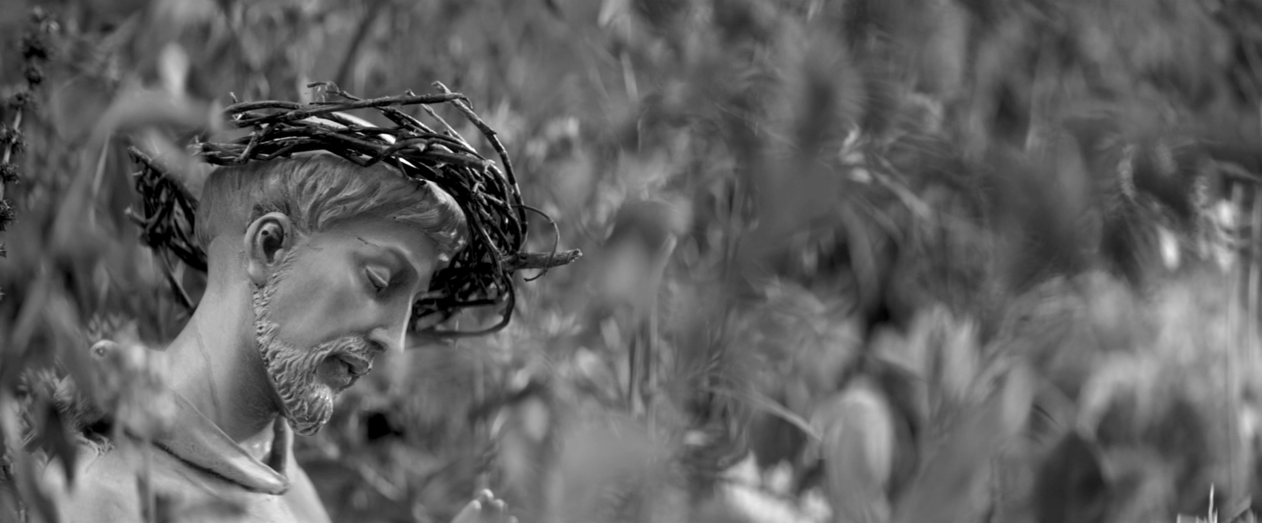
The Eyes of My Mother, one of the best horror films of 2016, stands in a grand tradition of scary iconography. Which is, of course, also a polite way of saying that Nicolas Pesce’s debut feature is not much of a departure. Francisca (Kika Magalhães), the film’s murderous anti-heroine, grows up surrounded by anatomical grotesquery and Catholic devotional objects. As is often the case in the genre, she is gradually driven to violence by the meticulously-crafted environment in which she lives.

But what makes The Eyes of My Mother different is the way these otherwise familiar tropes are woven together. The unsettling sets and weird props aren’t simply tossed in for dramatic impact, but arranged to unite the darkness of the setting with the psychology of the protagonist. This is why production designer Sam Hensen so richly deserved his American Independent Film Award last month, winning over some much more colorful and outrageous competition.

The two most prominent design themes are announced out very beginning, each with a single, striking object...

Click to read more ...

Monday
Mar062017

The Furniture: A Scenery Buffet for the Battling Burtons

Editor's Note: "The Furniture" is our weekly series on Production Design. We strongly suggest going forward that you click on the images to see them in their more detailed large glory. Many older films were of course designed for giant screens, not thinking of their eventual home as phones or small TV set. 

by Daniel Walber

 Franco Zeffirelli is not a man of subtle tastes. When he’s lucky, his opulent excesses achieve camp status. But when he’s not, it rolls over the audience like an 18-wheeler full of circus elephants. This has generally been the rule for his theatrical productions, some of which have nonetheless become war horse mainstays at major opera companies.

And so it may come as something of a surprise that the director’s overzealous artistic passion actually works quite brilliantly in his film version of The Taming of the Shrew, which opened 50 years ago this week. It turns out that his style is perfect for the frenetic madness of William Shakespeare’s screamiest comedy, heightened to a fever pitch by the deafening roars of Elizabeth Taylor and Richard Burton.

The setting is Renaissance Padua, introduced by way of a delightfully pastoral matte painting. Not content simply with a city in the rain, Zeffirelli showcases a rainbow. Two-dimensional sheep mingle with their three-dimensional, breathing brethren...

Click to read more ...

Wednesday
Mar012017

Nitpicking The Oscar Packages

by Glenn Dunks

I think for the most part we have been quite complimentary towards this year’s ceremony, yes? From its typically lush art deco set and its effectively-staged musical numbers to the surprisingly adept Jimmy Kimmel as host. But you’ll have to forgive me a few minutes while I nit and I pick at the one part I feel like they flubbed: the craft nominee packages.

Let's take a look...

Click to read more ...

Monday
Feb272017

The Furniture: Another Art Deco Oscars

"The Furniture" is our weekly series on Production Design. Here's Daniel Walber with a special Oscar ceremony episode. 

The following is an image of the 89th Annual Academy Awards, taken from the craziest moment of the broadcast. You know the one.

I am not here to talk about the Best Picture Situation, however. Instead, I’d like to draw your attention away from the drama and toward the shining Art Deco Gotham City/Metropolis that looms above it.

Since the Millennium, Oscar ceremony set design has been dominated by a few trends. I know this because I spent last week analyzing every televised set in Academy history. You can trust me. This year was very in tune with the past decade, with the notable exception of the “Classy Spaceship.” Thank heaven for that. If you don't know what I mean, here's a still of Jon Stewart being slowly released from a tube back in 2008...

Click to read more ...